Everyone loves the use of a good emoji. However, did you know that if they aren’t used in the correct way, they can cause cognitive overload for some users and become an accessibility nightmare for blind people or those with low vision? Similarly, as useful as hashtags are as an outreach tool, there are best practices to make sure they are inclusive for everyone to interact with.
Accessibility and emojis
You wouldn’t think a little smiling laughing face could present barriers online, and if used in the right way they are most certainly harmless enough. To make sure that your innocent smiley face doesn’t cause a very unhappy or angry face for your social media followers, there are a few accessibility rules that you need to follow.

Don’t use emojis to replace a word or meaning
Every emoji has a description assigned to it, which will be read aloud by a screen reader. For example, this emoji 😂 would be read out as ‘face with tears of joy.’ That’s quite a mouthful for one tiny laughing face.
Often, as the description hasn’t been checked prior to posting, it leaves a sentence making no sense for the user. An example of this is if you wanted to put “I’m feeling angry!” If you replaced the word angry with this emoji 🤬, it would read out “I’m feeling face with symbols on mouth!” This doesn’t exactly convey the same meaning and could cause some confusion.
This is the same as using emojis in between words. Here’s an example of how this would be read out by a screen reader:
- “Halloween 😱 is just 👻 around the corner 🧙♀️!”
- “Halloween face screaming in fear is just ghost around the corner woman mage!”
I’m sure you’ll agree, it’s much better to use words to convey your message or feelings to give context. We would advise against using them in this way, but if you really must use one then check if your descriptions make sense at the very least.
The importance of using emojis in moderation
Lately, we’ve seen a lot of people misusing emojis. Even if it is done as a light-hearted joke, with over 2 million people in the UK alone living with sight loss, it does have an impact on a wide portion of your online audience.
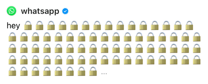
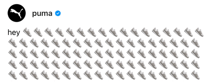
The recent Threads craze, was large companies repeating the same emoji over and over again in a variety of ways.
For example:


You guessed it, every single one of those emojis would be read out to a screen reader user. A joke which quickly becomes a frustration for many!
It is advised to use emojis sparingly; limiting your post to just one or two where possible. This, along with using popular, widely used emojis that translate well across devices.
Above all else, it’s best to ask yourself if an emoji is actually necessary in your content? If it is, then it’s best to place one emoji at the end of your post, after any important information. If not, leave them out.
Why you should not use emojis for bullet points or emoticons
This is a common mistake made by many. To try and break a list up in a post, emojis are often used to act as a bullet point. Don’t do this. For the same reasons as we spoke about earlier with replacing words with emojis, your content will not make sense.
For example, the list on the left would be read out like this on Twitter; making no sense at all.
🚨 important news:
🙌 sign up for events
😌 take part in a contest
⚓️ see where we are based
🤸♂️ trending topics
Police cars revolving light important news:
Raising hands sign up for events
Relieved face take part in a contest
Anchor see where we are based
Man cartwheeling trending topics
The same goes for emoticons. These are emojis for punctuation marks, letters or numbers that are used in posts. For example, using a double exclamation mark before important news, which will be read out as that. There is no need for that much text to be read out to a user, just put “important news!”
Using emojis with dark and light modes
More people are now using Dark Mode across their platforms. Always check that when using an emoji there is sufficient contrast between the emoji and background colour, so it can be seen. The same goes for light mode as well. Otherwise, there is simply no point in them being there.
How to write hashtags in an accessible way

Hashtags are an incredibly useful tool on social media, to quickly gain information on a topic that matters to you or a networking group that you want updates from.
Many people typically add hashtags in lowercase, however, this creates a barrier for blind users and people with low vision to access. This is because screen reader software needs to identify the individual words to be read aloud. If there are no spaces between words, the screen reader will attempt to read it all as one long word. Luckily, it’s very simple to remove this digital barrier, by writing hashtags in a #camelCase or #PascalCase format.
For example:
Standard format: #digitalaccessibilitymatters
PascalCase format: #DigitalAccessibilityMatters
Writing hashtags in this way can also assist dyslexic people and people with cognitive disabilities. In fact, it makes it easier to decipher for everyone, as you can see from the above example, it’s a lot more legible.
Conclusion
One little emoji has a big meaning behind it and using emojis and hashtags in the right way can be the difference between someone actually being able to understand and interact with your content. Small changes make a big difference for many people.
If you need further help with accessible content, we offer a range of training for different roles and skill levels.
