To enable equal ‘Education 4 All’ students, it’s essential that in schools and higher education, digital accessibility is made a priority. This guide will talk you through key considerations that can assist you in creating inclusive learning resources for all.
The need for learning materials to be accessible
The way that you write and present content can be the difference between students having access to the same learning opportunities as their peers both online and within the classroom, or being excluded from that information. When learning resources are created with digital accessibility being at the forefront, all students can flourish, no matter what individual need or device and software they may use.
The good news is that, not only do students benefit from resources that are designed to be accessible, but it can actually also save teachers time as well in the long run.
Along with some disabled students who rely on assistive technology in everyday life, all it could take for other students is for someone to:
- Fall and break their arm, so they may physically struggle to use their laptop.
- Have an eye injury, leaving them to rely on assistive technology to read out any learning materials.
- Have something as small as an ear infection, leaving them unable to listen to videos which don’t have captions added or podcasts without transcripts.
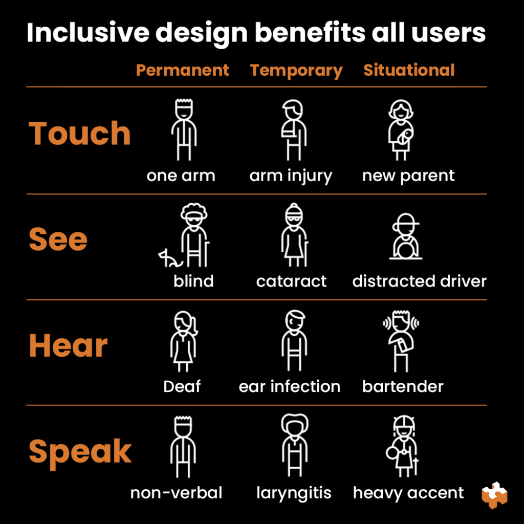
Photo credit: Microsoft’s Inclusive Design Toolkit
If learning resources aren’t designed to be accessible in the first place, then teaching staff would then need to use their valuable time to create and provide additional resources to accommodate those students. Whereas, by making simple adjustments when designing resources initially can eliminate these barriers and improve your content for all students.
What you’ll find within this guide
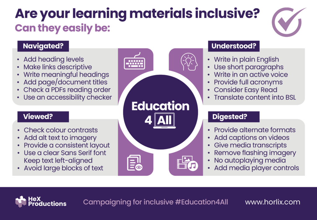
This guide will break down ways for your content to be able to easily:
How to help students navigate your digital content
We’ll begin with the most important inclusive considerations that need to be implemented on all web pages and documents. These are really easy to implement, yet sadly, not many people actively do so.

Use structured heading levels
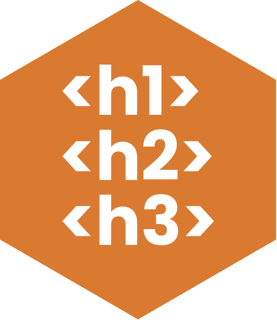
Although breaking content up into headed sections can help to make a page easy to scan, heading levels aren’t actually there for visual purposes. Correctly structured headings are imperative to those using assistive technology, as they provide a navigational structure for students to be able to effectively link between.
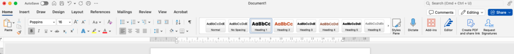
Heading levels can be easily added in Microsoft documents such as Word (which can be found within the top toolbar as displayed in the below example), along with in Adobe InDesign, Google Docs and more!
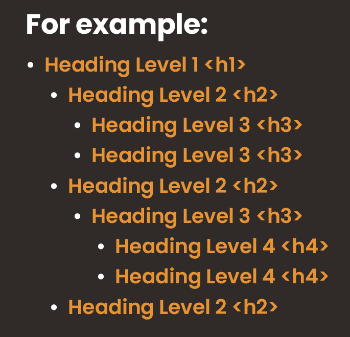
There’s a few things to think about when using headings:
- Heading Level 1 (H1) is the main high-level heading and there should only
be one H1 per page. - The order of the headings should then descend to Heading Level 2 (H2),
and subsections numbered below in sequence. For example, H4
should not appear before H3. - It is important not to skip heading levels, such as jumping from H2 to H4.
View how Accessibility Services Assessor, Alan Sleat, uses headings and links to navigate a web page:
Provide context with descriptive links
Students who use a screen reader, navigate through sites and documents by using links. Therefore, hyperlinks always need to clearly describe its function. If you simply write ‘click here’ or ‘read more’ the link will not make sense isolated from its context for students using assistive technology.
For example:
- You should write ‘Learn more about digital accessibility‘
- Instead of ‘To learn more, click here.‘
Give unique titles

Give your documents, slides, and web pages meaningful titles. This will help assistive tech users to know where they have navigated to and that they are on the right source of information.
Make sure PDF documents are inclusive
PDF documents are hard to use, search, keep up-to-date, and monitor. Often, PDFs also aren’t responsive on smaller screens. So, where possible, provide information on web pages themselves or via documents in their original format.
Although PDF documents are difficult to make accessible, there are ways to achieve this such as using accessibility checkers and ensuring reading orders are in a logical structure.
How to present content so it can easily be viewed
For students to get the most from your resources, content should be clearly and consistently presented.

Along with providing a logical heading structure to break up content:
- Avoid using large blocks of text, so you don’t give cognitive overload to users.
- Use bulleted lists to break up content into bite-sized sections.
- Provide clear and consistent spacing between content sections.
Accessible typography considerations
Selecting the right font is vital to make your site legible:
- Avoid using any fancy fonts. Use a simple font type such as Arial or Calibri.
- Use a font size of at least 12pt or above.
- Keep text left-aligned and avoid using full justification.
- Don’t underline text or use italics. Underlining is only to be used for identifying hyperlinks.
- Use sufficient character and line spacing.
Choosing inclusive colours

The colours you choose makes a massive impact on your learning material’s accessibility.
Whether on:
- A document or web page background
- Text overlaid on an image
- Visual information, such as a graph
- Video content
It’s imperative when using colour to ensure that there is a strong contrast between text and the background. Poor contrasts, may not be legible, which can impact all users. In particular, student’s with low vision or colour blindness may find it impossible to view some content without inclusive considerations in place. There are really useful free tools on the web, such as WebAIM’s contrast checker, that can help.
Adding alt text descriptions on all imagery
Blind and visually impaired students also want to view your content. Alternative text, commonly known as alt text, is vital to give these users context on what you are displaying in your web page or document imagery by adding a visual description.
This facility is available on almost every platform. When adding alt text, it’s important to remember to:
- Keep descriptions short. Try to capture the concept of the image in a sentence or two.
- Avoid duplicating text if it is in the document nearby to the image.
- Avoid writing phrases such as ‘an image of’ as screen reader software already highlights this to the user.
- Display the function of hyperlinks that are images, in order to direct the user to where they will navigate.
Ways to make your content simple to understand
It isn’t only about the way you structure content, the way you write it makes a large difference to students. Who wouldn’t want the content that you’ve worked hard in putting together to be easy to understand and digest? Adapting your writing style has vast benefits for all students and helps to propel their overall learning experience.

To aid in improving reading comprehension for students, it’s important to use plain and simple language that:
- Doesn’t have complex terminology and technical terms (unless necessary).
- Removes figures of speech, idioms, and complicated metaphors.
- Is provided in short line lengths to reduce reading speed. This should be an average of under 20 words per sentence.
- Provides the full version of acronyms and abbreviations.
- Is in an active voice, rather than a passive voice, to reduce ambiguity.
- Focuses on the important information, keeping it concise.
You can check your content scores through online software like Readable or the Hemingway App to allow you to make alterations to become more user-friendly and support every learner.
British Sign Language (BSL) translation

To assist Deaf students, have you considered translating your material into BSL to help them to understand your course content? This can be translating the content of your web pages, documents, videos, or important announcements.
Easy Read features
Another way you could help to support students is through the use of easy-read options. This breaks down content into simplistic illustrations, like you can see in the following video which Homefield College has implemented:
Inclusive media considerations to aid with digestible content
Everyone is different and we like to digest content in varied ways. Some of us prefer to read text, whilst others would rather watch a video or listen to audio. Therefore, breaking information up by providing alternative formats, like imagery or different media types, can be a very effective learning tool.

Accessible video creation
Videos are used all the time in education and, unfortunately, their accessibility is often overlooked. However, it doesn’t add significant time onto a project’s timescale, especially if considered from the start.
Captions are probably the most widely-used methods for enabling video accessibility. They don’t only assist students with disabilities, but enhance the overall user-experience. Captions should be added to all pre-recorded videos with spoken word, synchronised to the audio. These can either be open (burned into the video) or closed (able to be toggled on and off). Transcribing captions has never been easier to do in YouTube or Adobe Premiere Pro. It’s important to always double-check your captions to ensure they are accurate. In addition, you can also manually type captions into the videos.
Like alt text, adding a small video description alongside media can also help blind and visually impaired students to picture what is happening in the video. This can be short description of the setting, the person in the video, and any text or visual information they may need to be aware of.
Another important consideration with videos is to make them safe for students who are photosensitive, as certain kinds of strobing or flashing animations will trigger seizures. So, avoid using flashing content where possible. It’s crucial not to use videos that have more than three flashes within a period of one-second. If you have content on your site that cannot be removed, which may impact these users, then place a warning before the video and make sure it does not automatically play.
In fact, it’s best practice to ensure that no videos automatically play and media controls are also present when videos have been embedded, to give control to your students.
When to provide a transcript
Present a transcript file alongside any media. A transcript file is a downloadable text version of what is said and heard in the video and descriptions of actions or important on-screen information. This provides context to visually impaired users to aid them in understanding the video’s content, which is read by screen reader software. If the video content can be found within the main web page’s body of text, and a video is just being used as an alternative format, then a transcript isn’t necessary.
Like video files, always provide a transcript file when embedding audio files, like a podcast, in documents or on web pages to assist students who are Deaf or hard of hearing.
What to consider when presenting infographics
Although infographics can be really useful to clearly explain and display detailed content, it’s important to consider how to convey this information for blind students and people with low vision.
In these instances, provide any content in imagery with large visual information in either the main body as text next to the picture as well, or use a link to a separate page for students to access.
Download our Education 4 All inclusive design checklist
To help give you a useful reminder when creating learning resources, why not download and print off our inclusive design Education 4 All checklist and keep it around your workspace.
Inclusive learning for all students
There may seem like a lot to consider when designing and writing your content to be inclusive. However, all of these methods can be easily implemented, and it’s just a case of getting into good habits. After no time, you’ll effectively add these features as second nature and the results will be vast for both your students and yourself.
Teacher’s have chosen this career path because they want to help students to be the best version of themselves, and with these inclusive skills, you now have the confidence in knowing that you are providing them all with the best learning opportunities.
If you want further advice, we offer upskilling accessible content training for educators.