Case study brief: Leicester, Leicestershire, and Rutland (LLR) Mental Health and Wellbeing Hub
The NHS provided funding for the creation of 40 mental health and wellbeing hubs across the UK.
The Hub’s purpose is to support the mental health and wellbeing of all staff. This is achieved by screening staff for risk, offering clinical assessments, and clear triaging to available support services.
HeX created an exciting digital journey to support the health, emergency services, and social care workers for the area of Leicester, Leicestershire, and Rutland (LLR).
Helping the NHS access vital support made this case study unique
Health, social care, and emergency service workers work under a tremendous amount of pressure. Even more so, since the Covid-19 pandemic, and many have suffered from mental health issues as a result.
The mental health and wellbeing of our NHS is of paramount importance and HeX is proud to have been able to give something back to this incredible workforce. Ensuring that all staff have a direct single-point of access, with simple navigation and clear taxonomy, to easily locate the vital support that they require.
Web development activities delivered
- Conducting health hub research and stakeholder reviews
- Providing fact-finding feedback and content mapping workshops and reports
- Brand creation
- Website design and web development
- Content assistance
- Accessibility statement creation
- Providing Accessibility Awareness Training
- Delivering Accessibility Content and Editor Training
- Project management and accessibility consultancy
- Website maintenance package
Hub research and website design consultation
HeX Productions has vast past experience in creating websites and hubs for health care services, such as the WSUN Autism Hub, Southwark Wellbeing Hub and Blood Pressure UK. With this experience our experts knew exactly how they wanted to approach this important project.
HeX experts conducted research into healthcare hubs, and analysed the current information and support services available. This allowed us to create a clear design structure.
When we design and build a website, we provide static designs and showcase interactive design features as we iterate through development phases.
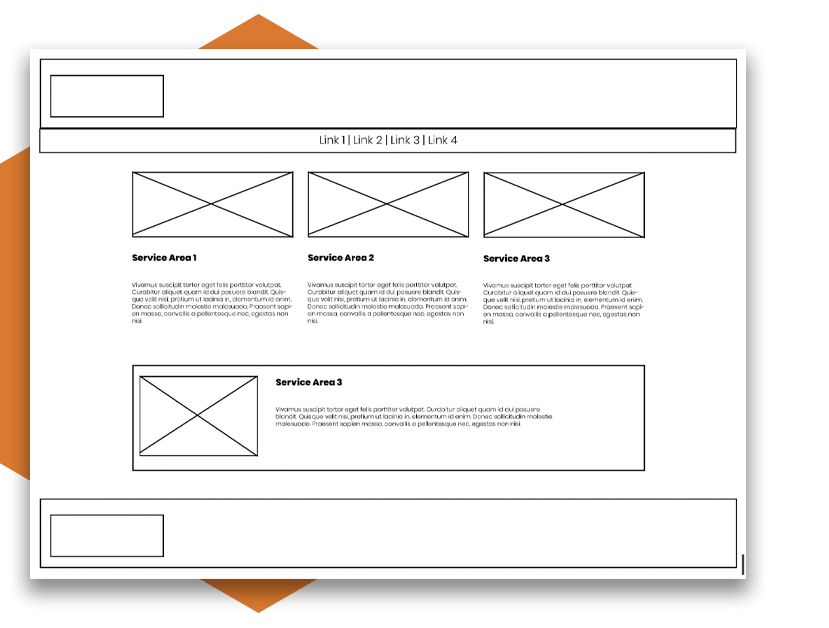
Creating a site map, outlining key landing pages, and call-to-action triggers, our designer produced a series of wireframes. These are simple digital line drawings that visually map out the components of a website.
Content mapping workshops gave stakeholders the opportunity to provide input into this design work. These sessions allowed our team to give an understanding on the website’s structural elements, providing a greater insight into the defined user journey.
Taking inspiration from an NHS brand guideline, our designer then created an accessible colour palette and clear brand offering. When agreed upon, this strong visual identity was applied to the wireframes, bringing the design to life.
How a strong taxonomy can power a website
The crucial aspect of this website build was in ensuring that health care professionals could rapidly access support services with ease.
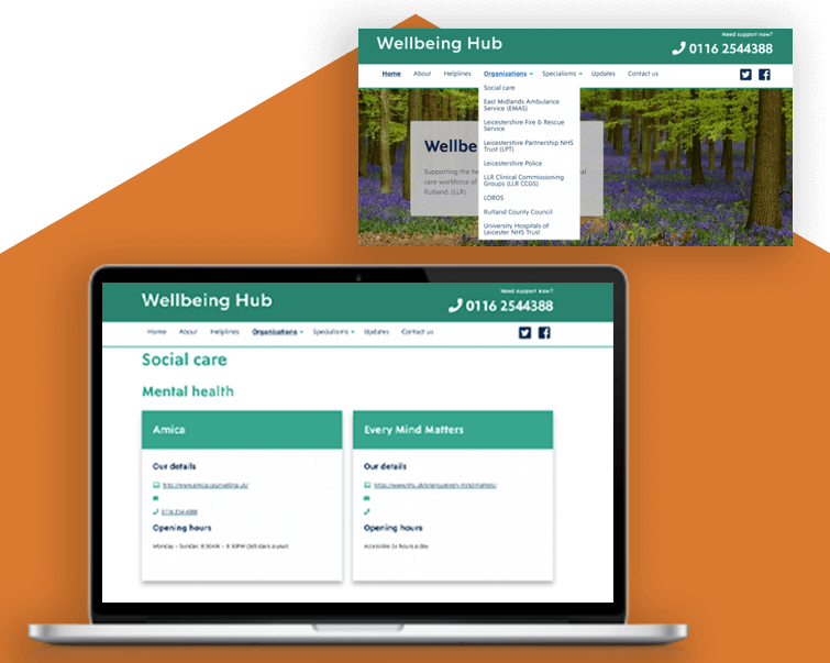
Using WordPress, and Gutenberg blocks, our team of expert developers created a simplistic website structure, with strong taxonomy, and clear call-to-action boxes.
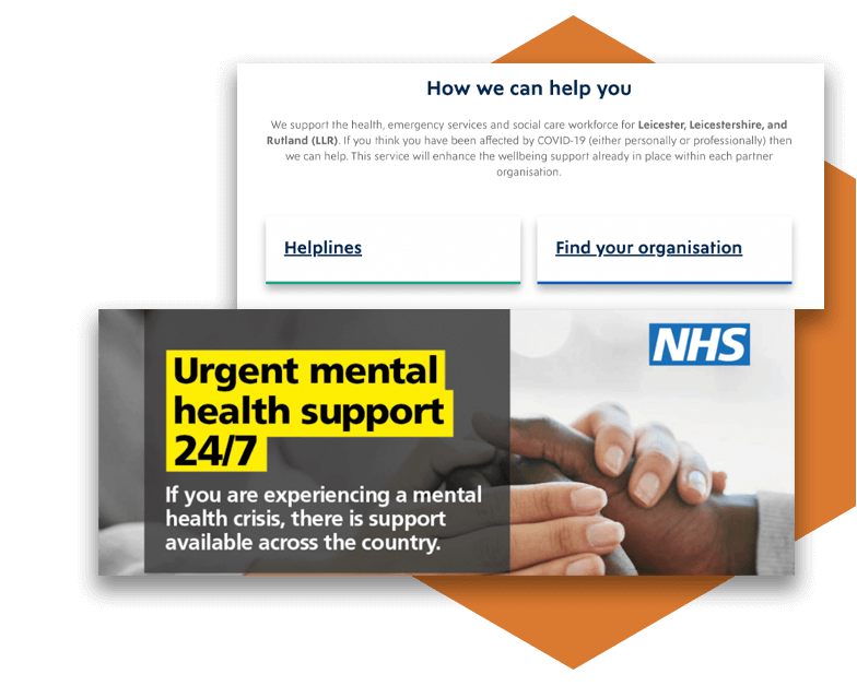
Our team broke down the user-journey, to create an intuitive flow through the Hub. Embedding visually-striking categorised Gutenberg blocks to provide the user with instant access to relevant support.
This structure created a clear and identifiable route to relevant support helplines. Giving a defined breakdown of appropriate organisational services and dedicated counsellors and therapists.
We created clear website specialism sections. These highlighted whether the content is blogs, guides, or referral services. Along with stating if the information is for personal or managerial use.
Designing and building websites with accessibility at the forefront
At HeX, every website that we produce is designed, built, and maintained to be accessible.
We achieve this by working with our partners Shaw Trust Accessibility Services. These are a team of disabled testers, who utilise different assistive technologies to assess a website’s accessibility.

Each website that we create undergoes the following accessibility testing:
- Automated testing, using software which crawls the site for errors.
- Technical manual review – a HeX technical expert troubleshoots the website’s coding.
- User testing, from both the HeX team and from the Shaw Trust team.
The LLR Mental Health and Wellbeing Hub is fully compliant with the Web Content Accessibility Guidelines version 2.1 AA standard.
HeX has provided an Accessibility Statement for the Hub. This statement lets users know how they are able to use the Hub and technical information about the site’s accessibility.
Accessibility training for staff and content editors

Within the healthcare sector information changes quickly. Therefore, it was essential that we trained the NHS LLR team on how to maintain and create accessible website content with ease.
We provided Accessibility Awareness Training to staff in order to give an understanding into the recommended design decisions. Within this training we provided demonstrations on how assistive technology users navigate a website and the accessibility barriers that they face.
Our experts gave additional in-depth training to those responsible for maintaining the website. Teaching their team how to add content to pages using the bespoke site blocks and how to implement accessible content using the back-end of the website. This left the team with the confidence to keep their site updated and accessible upon project completion.
Mental Health and Wellbeing Hub impact for NHS staff
The health, emergency services, and social care workforce across Leicester, Leicestershire, and Rutland now have access to the crucial mental health and wellbeing support that they require.


The Hub is WCAG 2.1 Level AA compliant. This ensures that the Hub’s information is available for all of their users, regardless of assistive technology devices or software that they may use.
With direct signposting, and a structured breakdown of organisational services, we have created a clearly-defined user journey. Resulting in NHS staff now being able to swiftly navigate to proactive outreach and valuable healthcare services when they need it the most.
Our training has empowered the LLR website editors to be able to easily manage and implement content onto their website. All in an accessible way.
The HeX team continues to support the LLR team by providing an ongoing maintenance package. This maintenance ensures that the Hub remains secure and up-to-date, introducing any new functionality features that emerge.
More case studies about accessible web development

Wiltshire Service Users’ (WSUN)
WSUN required an Autism Hub building, linking to their main website. The Hub needed to create accessible information for those with autism, their families, and carers.
Genius Within
Due to the large number of Genius Within’s users being neurodivergent they required a re-design and re-development of their website, with a user-focused approach.

