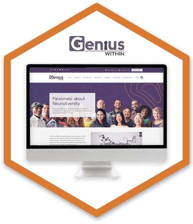
Case study brief: Accessible web development to support the neurodiverse
Genius Within is a social enterprise that was established by Dr Nancy Doyle, a leading psychologist working with neurodiversity. They provide support for neurodiverse people who are not in the workplace such as students, those who are unemployed, or in the justice system. They are also providers of training for organisations wanting to understand more about neurodiverse individuals.
Genius Within put out a request for support for a re-design and re-development of their website, with a user-focused approach.
A board member of Genius Within, who is a good friend of the HeX team, recommended that we tendered for the contract due to our experience of user-focused design and accessibility experience, with the likes of Ashfield District Council. We were able to secure the contract and were informed that the organisation’s website was to be totally revamped.
Creating a bespoke website for those with neurodiveristy made this case study unique
It was vital that the Genius Within website was accessible, due to the large number of users being neurodivergent. So, it was essential that the website was as clear to use as possible.
Working closely with the team at Genius Within, HeX devised an approach that would allow for a streamlined user journey across the site. Our accessibility experts worked on wireframes and designs, incorporating vital user journeys into the flow of the website.
Alongside the structural elements of the site, developers implemented bespoke features for the Genius Within website that would help users find information quickly and easily. One such element was the categorisation and ability to filter coaches and for users to be able to book a specific coach, with Stripe payments integrated into the system seamlessly.
Please note: This video has animated elements – you can view this video without moving animations

Web development activities delivered
- Website design work
- Web development, including the creation of bespoke site elements
- Integration of Application Programming Interfaces (API)
- Delivering Accessibility Content and Editor Training
- Project management and accessibility consultancy
- Ensuring their site met with WCAG 2.0 standards
- Gaining a Digital Accessibility Accreditation
Defining clear user journeys to inform a user-focused website design
Genius Within provides support for individuals who are neurodiverse. Their aim is to prove that disability is not a barrier to employment and that anyone who is neurodiverse has as good an opportunity in the workplace as anyone else. HeX understood their aims and knew that providing a website that was as easy to use as possible was important.
The design phase was completed iteratively, with a wireframe being done initially to effectively map out the user journeys that Genius Within users would go through. Allowing time for feedback throughout.
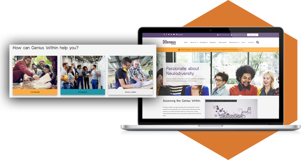
We identified three key user journeys on the website – the first being for ‘Individuals’, the second for ‘Employers’ and the third for people needing support with ‘Social Justice’. These key user journeys were marked as content boxes on the homepage of the website. These content boxes allowed users to start their journey down the correct path and be presented with services that would be relevant to them. The navigation was designed to be clear and consistent throughout the site, with obvious dropdown menu items and clearly labelled pages.
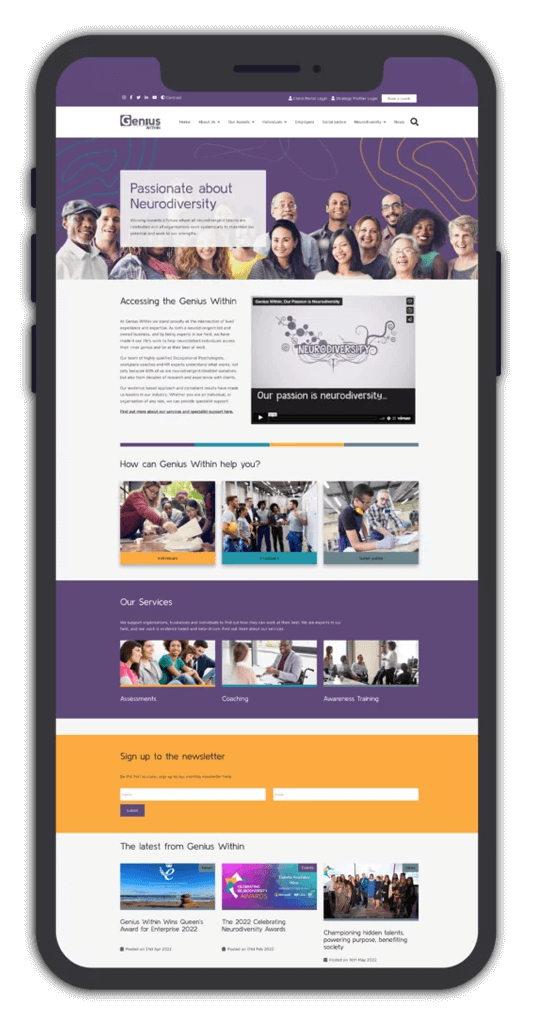
Positive imagery was used throughout the design to reflect the positive and supportive nature of the work that Genius Within do.
The site’s colours were chosen from a number of colours supplied by Genius Within. The colours implemented on the site were purple and yellow, with an accent colour of blue. These colours gave off a soft and friendly atmosphere to the website. The content boxes across the site were designed to be highlighted obviously through different colours. As the home page is scrolled, the breaks between information are immediately apparent by a different colour.
Great consideration for the Genius Within users was taken throughout the design approach, making sure that elements were clear and easy to use. It was vital not to create complex pages, hence the block layout approach to the site.
Implementing bespoke development features to streamline the user journey

With the designs completed, it was time to move on to the development phase. It was decided to build the website in WordPress, using WordPress’s Gutenberg blocks feature in HeX’s bespoke custom theme. This block feature has become best practice for our WordPress builds and makes the website more intuitive to edit once handed back to the client. It overhauls the classic text editor and allows content to be represented in blocks. This feature allows a more visual and intuitive way of adding and editing content on the site
Providing the option to filter results based on specialisms to increase ease of use
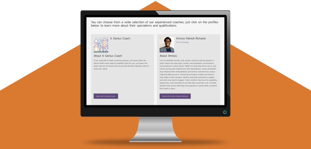
One of the features implemented into the build was the option for users to filter the coaches by specialism in a certain category. Genius Within provides more than 130 coaches across a broad number of specialisms to help users get employment advice and guidance.
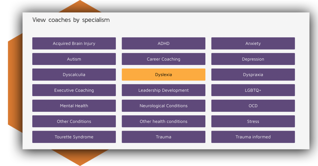
It was important for Genius Within to have the option for the right coach to be assigned to the right user, so the filtering system was created. This allows users to go through a list of neurodiversity categories that best match their situation. By selecting the specialism of the coach that best matches their situation, a focused list of coaches is then listed. Once a user has selected the specialism, only the coaches that have been tagged with that specific specialism appear on the results page.
If users don’t know which coach to select, it was later decided that users should be able to select the option for Genius Within to choose a qualified coach for them. This option is pulled through into every search and is designed to give users additional peace of mind when looking for coaching services.
Implementation of Stripe e-commerce payments to streamline payment process
As part of Genius Within’s offering, users are able to pay for a coaching session once they have selected an appropriate coach. It was important for this process to be as simple as possible for users. The system that was able to give the best results was payment integration using Stripe. A payment portal, integrated through the Stripe API allows for users to pay online for a coaching session, rather than waiting for Genius Within to get in touch and take the payment at a later date.
The positive part of the Stripe integration is that the payment form is on one page, meaning it doesn’t interrupt the user flow. The payment option is integrated into the profile of each specialist coach, allowing for a more seamless payment process. The user does not need to navigate to a separate payment window or service for the process to complete. The simplicity of this means that it opens up the ability to book a coach for anyone without adding additional anxiety of having to complete complex forms.
Categorisation of news stories and blogs to communicate expertise
It was vital for Genius Within to display their expertise on the website. Dr Nancy Doyle, the CEO of Genius Within is a regular Forbes columnist and writes pieces regularly about neurodiversity and psychology.
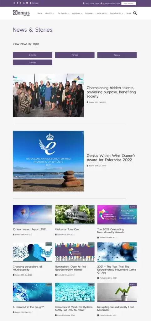
This meant that the news and blog pages needed to be designed in a specific way to categorise the news stories. The team at Genius Within identified the need for a “News”, “Events” and a “Forbes” category. These categories were then displayed on each individual piece published on the news page. This categorisation makes it immediately obvious what the news story is regarding and allows users to identify what they are reading.
The Events category was also used in order to categorise webinars and training sessions that Genius Within is running. This structured approach to the news page allows for a clearer journey for users when trying to understand the expertise of Genius Within.
An accessible website for future developments
Once the development phase was complete, it was given to the team at Genius to approve and implement content. Genius Within has a number of ideas for future developments and building the site in an accessible and organised way has allowed for further developments to be implemented seamlessly.
As part of the development process, it was important for it to be as accessible as possible. In order to ensure this is the case, the website was sent off for testing with our disabled user testing partners, Shaw Trust Accessibility Services. This user testing assessed the website on its conformance with WCAG 2.1 Level AA. Thanks to our expert development team and our iterative testing throughout the development process, very few errors came back.
Genius Within has now passed their digital accessibility accreditation from Shaw Trust Accessibility Services.
As the development agency on the project, we were proud that very few issues were flagged from the Shaw Trust user tests. As part of our processes, we continually test our development projects throughout to ensure that they stay accessible during the site build. This helps to minimise the number of errors picked up in the user testing phase.
This accreditation gives Genius Within website users the assurance that the website has been tested with disabled users. It will also give Genius Within the peace of mind that they are WCAG 2.1 Level AA compliant. There is also reassurance that users of all abilities will be able to access their website without the need of additional assistance or being faced with any obstacles.
Genius Within project outcomes and impact
Once the development phase of the website was completed, Genius had an accessible website that conformed to the Web Content Accessibility Guidelines 2.1 at Level AA compliance.
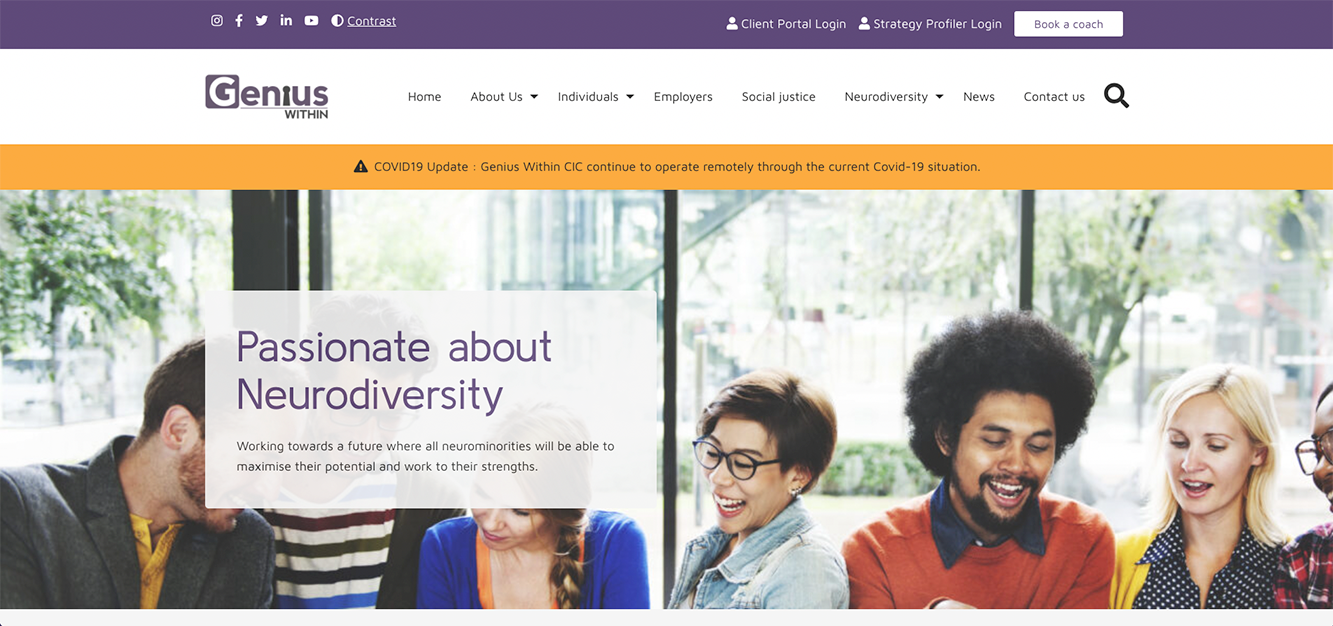
The site was now able to facilitate users in finding the solutions that were right for them, through clear and navigable user journeys.
Genius Within were able to categorise their news and blogs correctly, being able to showcase their expert publications, published by Forbes, clearly.
At the end of the process, we have been able to deliver an accessible website to Genius Within with clearly defined user journeys and easy to use features. Our knowledge about the barriers that neurodiverse individuals can face when navigating websites has been used significantly in this web project.
More case studies about accessible web development
Together for Mental Wellbeing
10 years ago, our journey began helping the charity to showcase their range of mental health and wellbeing services, ensuring that this important support was accessible for all. This case study will look into the differing accessibility projects and support that our team undertook during this time.
Homefield College
Upon discovering that their website was not WCAG 2.1 Level AA compliant, Homefield College contacted HeX after being recommended by a contact at Natspec, the membership association for specialist FE colleges. Our team was then commissioned to redesign and rebuild the Homefield website.

