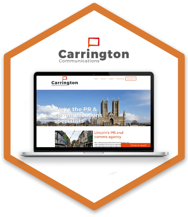
Case study brief: Web design and development of Carrington Communications
We knew Rob, the company’s founder from the Nottingham creative circuit and after gaining lots of experience in PR, he decided to set up his own company and Carrington Communications was born. He came to us for support in designing and building his new site using the WordPress platform.
HeX's striking brand design work made this case study unique
Our graphic designer approached this first and created a sleek and stylish logo that reflected the professionalism of the brand. He also created a web design that the development team were able to make into a responsive website that was easy to navigate and focused on user experience.

Web development activities delivered
- Web design and branding
- Web development
- Delivering Accessibility Content and Editor Training
- Project management and accessibility consultancy
Website design process
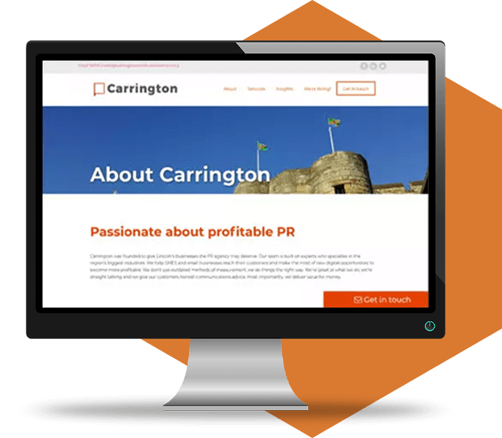
Matt, our freelance designer worked with Rob’s wish list and came up with a contemporary, design – suited to a company in an industry where appearances really do matter. Tying in the square speech bubble logo and corporate colours, the new site’s design included eye-catching images of Lincoln, linking the city-based company to its target audience of local businesses.
Mobile first approach
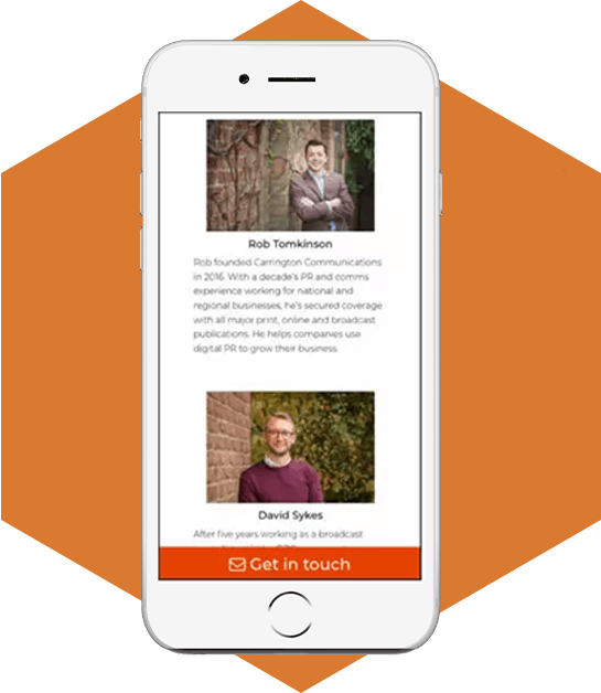
As you’d expect from a communication specialist, a responsive site was important to Carrington. They knew that as they’d be supporting companies with their digital communications, their own website was both their shop window and an illustration of the work they do. Therefore when we built the site it was done ‘mobile first’, meaning that our developers created it based on a mobile site design to work well on mobile devices, with a one column design, gradually increasing the complexity to suit desktop users.
Page template creation

As with the majority of WordPress sites that we work on, HeX’s developers used custom fields to unlock the product’s flexibility and give Carrington a range of content templates. For example, blog posts are showcased on the homepage and staff profiles can be added to the About Us page as the team grows.

WordPress web content editor training
Handing over the finished WordPress site to the Carrington team was a straightforward affair.
They were already in the business of writing web content so it was simply a matter of ensuring that they could access the intuitive WordPress interface, and had basic training to keep their content updated.

More case studies about accessible design and development
Pearce and Dale
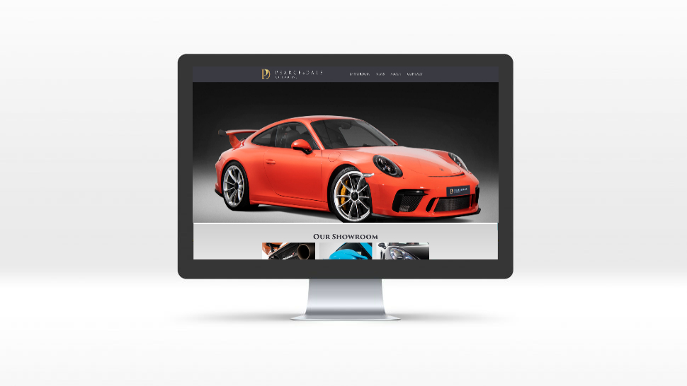
Pearce and Dale needed an online platform to be able to showcase and list vehicles for sale in order to attract a wider audience.
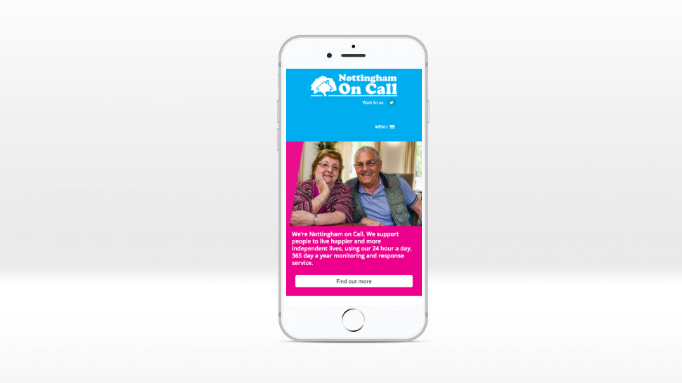
Nottingham on Call
We created a sleek look and feel that was accessible and easy to understand for all of visitors along with a simple editor tools.

