Case study brief: Robust Accessibility training for digital content editors
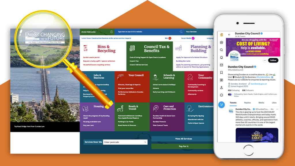
Dundee City Council is a local government authority for the City of Dundee. They offer a wide variety of information and services to residents and businesses across this dynamic city.
Being in the public sector, the Council has a duty to ensure that their online content is accessible. More than this, the Council puts their citizens at the heart of everything they do. This is why they approached HeX for a range of accessibility training. In turn, ensuring that their content editors provide accessible digital services for their community as a whole.
Assisting the Council with ‘Changing for The Future’ made this case study unique
Dundee City Council’s strategy is ‘Changing for the Future.’ A part of this strategy model is ‘how they design their services, making the best use of technology, and working in partnership with others’. A strategy that focuses on ensuring that the lives of their citizens; regardless of background, age, or circumstance, are made better by delivering the services in a way that meets their needs.
Our training empowered the Council’s content editors to design their digital service offering with accessibility at the forefront. Giving inclusive access to their information for all.


Accessibility training package learning topics
Two-day workshop, for varying content teams, aims and objectives:
- Web Content Accessibility Guidelines (WCAG) 2.1 and UK accessibility legislation
- Introduction to assistive technology devices and software
- Live website assistive technology demonstrations
- The pros and cons of automated testing tools
- Accessible content and design considerations
- Creating accessible documentation
Raising awareness on the need for digital accessibility

Our training began by providing a broad overview on why accessibility is crucial for society. Using engaging visuals to identify the impact it has on people when platforms aren’t inclusive.
With the Council being in the public sector, it was important that the team gained an understanding of accessibility legislation. This involved talking the content editors through Web Content Accessibility Guidelines (WCAG) 2.1 standards. Showcasing how simple adjustments can make sites perceivable, operable, understandable, and robust. In turn, removing accessibility barriers that people with disabilities commonly face when online.
Understanding how a web page’s structure impacts on users of assistive technology

We wanted the teams to gain a deeper understanding on how someone with disabilities may navigate a site. An important aspect of this is to learn about the use of assistive technology.
This important session, delved into who uses assistive technology and what devices and software are available. To enhance the team’s knowledge in this area, we gave live demonstrations. This allowed them to see first-hand how an online user would interact with a website, using items such as:
- Keyboard-only
- A screen reader
- Voice control
Presenting the essential need to consider the structure and design of a site to enhance the user experience.
Introduction to automated accessibility testing
Now the teams were familiar with assistive technology, we looked at ways they could remove online obstacles for those users.
To do so, we introduced an array of online automated testing. This hands-on workshop provided the Council with useful tools to seek out common web page accessibility errors. Giving the teams a chance to search external websites and assess their own contents accessibility.
This empowered the team to make manual checks. Using tools such as WAVE, to assess content items such as:

- Incorrect or missing heading levels
- A lack of alt text
- Insufficient colour contrasts
Reviewing the group’s findings and explaining the reasons behind the discovered errors and giving preventative knowledge to enable them to remain inclusive. Letting the team see the difference and importance that manual user-testing provides to digital accessibility.
How to design with the user in mind
Moving on to robust Content Editor Training. With the aim to give the team the confidence to always design with accessibility at the forefront.
Presenting clear walkthroughs on how to correctly:

- Implement heading levels
- Design in a clear and consistent way, with a focus on page layouts
- Write content in a user-friendly manner and assess readability levels
- Use descriptive hyperlinks to help user-navigation
- Write effective alternative text for imagery
- Create accessible media, such as captions and transcripts
- Make social media channel content inclusive. Looking at the use of items such as accessible hashtags, emojis, and media files.
Creating accessible digital documentation

Many websites contain online documents. Alternatively, internal documents are shared amongst numerous colleagues. So, making sure that these are accessible is key.
It was now time to put their new accessible content editor skills into action. With the next step being to amalgamate these learnings into digital documentation.
In Microsoft Word and PowerPoint we enlightened the team on where they could find and set up their heading levels and where to add features, such as alt text. Also, showing how to make use of the software’s built-in accessibility assessment tools.
Moving onto the more tricky area of converting and creating accessible PDF documents. Walking the team through how to check a PDFs reading order and further PDF document assessments they could utilise. Making sure the council’s documents were both user-friendly and accessible for all to engage with.
Helping Dundee City Council change for the future through digital accessibility
Our practical workshop has demonstrated that small changes to the Council’s workflow can make a big difference to their online community.


Our accessibility awareness and hands-on assistive technology sessions gave a deeper understanding of the obstacles disabled users face on websites.
The Council’s content editor teams now have the skills and confidence to write and design content with accessibility in mind. Along with the knowledge on how to seek out and eradicate accessibility flaws within existing online content.
Enabling Dundee City Council to meet WCAG 2.1 standards and UK public sector legislation. Ensuring the Council’s digital future will be inclusive and deliver a service that meets all of their users needs.
More case studies about accessibility training

Canonical
Canonical came to HeX to provide a robust three-day training package. Requiring hands-on workshops to upskill their team on all areas of digital accessibility.

King’s College London
KCL approached our team in need of accessibility awareness and content editor training for their communications team.

