Case study brief: Accessible web design and development for Collinshallgreen
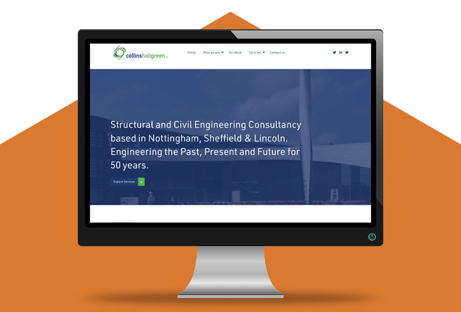
Collinshallgreen is a progressive structural and civil engineering consultancy firm.
Being engineers who work on design challenges, with a precise eye for detail, it was important that their website represented these qualities.
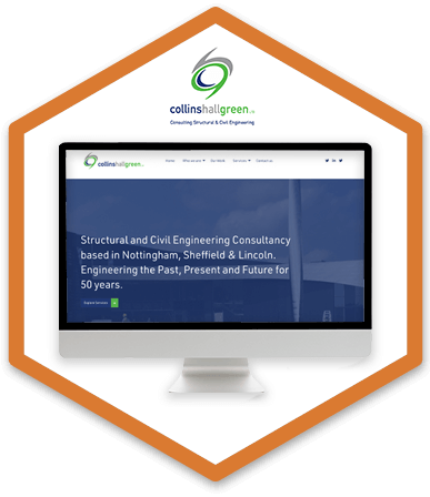
Collinshallgreen approached HeX for a complete rebuild of their website and content development work.
Their website was built and designed to comply with Web Content Accessibility Guidelines. This allows for inclusive access to the engineering services and solutions that they offer.
Creating a website engineered to stand out from the crowd made this case study unique
Collinshallgreen delivers engineering solutions from, HeX’s hometown, Nottingham. Along with their offices in Sheffield and Lincoln, running for an impressive 50 years.
There’s always something special about assisting someone from where you live, in this case, even more so. Collinshallgreen is owned by our Creative Director’s father…no pressure there then.
Knowing the HeX Productions team’s exceptional skill set, and accessibility knowledge, we were commissioned to complete an overhaul of the website’s look, feel, and user interface.


Web development activities delivered
- Website design work
- Web development, including the creation of bespoke site elements
- Delivering Accessibility Content and Editor Training
- Project management and accessibility consultancy
The HeX approach to website development, content design, and taxonomy
HeX Productions built Collinshallgreen’s previous website. Knowing our expertise in web design, we were now commissioned to create an up-to-date, clean and concise site.
We redesigned Collinshallgreen website using HeX’s bespoke custom theme, using WordPress. Our experts have significant experience in using this Content Management System.
Using Gutenberg blocks, we overhauled the classic back-end editor and created greater flexibility with the style and features of the website. These blocks allow content editors to see elements of the site in a more visual and intuitive way.
Our team wrote the website’s content in a simplistic language for all users to easily understand, laying the content out in a clear and accessible format.
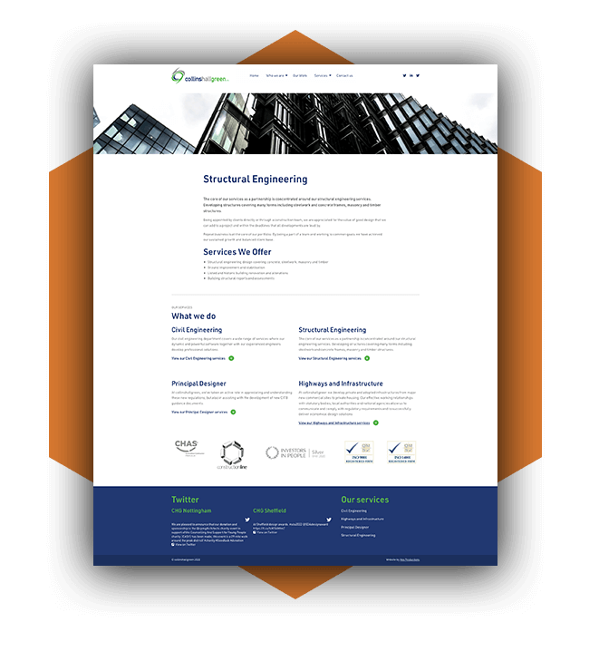
Clients being able to navigate to the services that they required with ease was essential in the website build. Our team used clear taxonomy throughout the site, with striking categorisation blocks, to provide a clear user-journey.

Main content pages contained summary boxes. These provided bulleted lists, summing up the page content to assist users in locating key information.
These summaries reduce cognitive load amongst individuals and can assist those short on time with page navigation. By adding summary boxes, they can both aid in navigational flow and enhance a website’s Search Engine Optimisation (SEO).
Providing clear user journey breakdowns have optimised a logical and streamlined intuitive flow through the website, achieving instant access to relevant information for the user.
Building digitally accessible websites with the user in mind

We ensure that all of our sites are built to comply with Web Content Accessibility Guidelines (WCAG) 2.0 Level standard.
Accessibility shouldn’t be a choice, that’s why HeX’s ethos is to build every website to be accessible for everyone.
Building a website to be accessible doesn’t affect the site’s aesthetics or functionality. However, creating an inaccessible website does stand out from the crowd, just for the wrong reasons.
This means that our websites are built to be simple to understand, easy to navigate, with a clear user journey. Removing any accessibility barriers for those with visual, hearing, mobility impairments or those with learning difficulties.
Collinshallgreen website redesign and accessibility training impact
We have achieved a smart, simplistic website, with a clearly defined user flow.
By implementing clear categorisation blocks, with defined signposting, users can now flow directly to the relevant services with ease. Creating an enhanced user experience.


Their website meets WCAG standards, ensuring that all users can access the website, no matter what device or software they are utilising.
To empower the Collinshallgreen team to continue to implement accessibility principles on their website, we provided them with Content Editor Training. This included:
- Guiding them through how to successfully structure their website’s content and layout.
- How to use the bespoke Gutenberg blocks and confidently maintain the back-end of the website.
- Training them on how to make accessible forms, and ensure that multimedia formats are accessible with assistive technology devices.
- Showcasing best practices in creating online content documentation, such as PDFs, in an easy-to-read format, and using a user-friendly language.
Their team is now confident to consistently create and maintain accessible additions to their web estate.
We are looking forward to working with Collinshallgreen in the future, working towards gaining a full website accreditation, with our partners at Shaw Trust Accessibility Services.
More case studies about accessible web development

Ashfield District Council
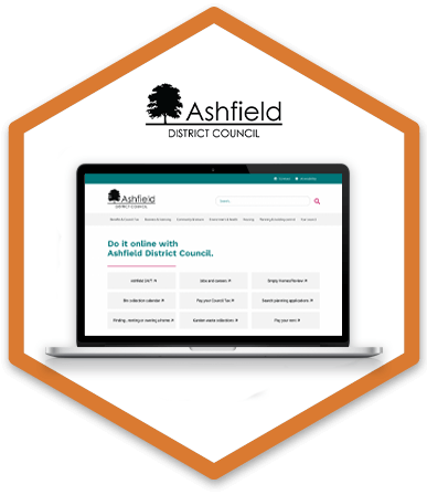
HeX worked with Ashfield District Council, in Nottinghamshire, to assist in the development of a new accessible brand and website that was fit for purpose for a digital-first local authority.

Genius Within
Due to the large number of Genius Within’s users being neurodivergent they required a re-design and re-development of their website, with a user-focused approach.

