Case study brief: Supporting the UK’s leading mental health charity in becoming accessible
Together has been supporting people with their mental health since 1879. Their incredible work helps around 4,000 adults each month throughout England. This helps individuals to help in leading independent and fulfilling lives within their communities.
Experts believe that 1-in-4 people will experience a mental health problem at some point in their life. Therefore, it’s vital that support and resources are available for everyone to access. Which is why, Together enlisted the help of our accessibility experts to achieve this.
Our 10-year accessibility collaboration made this case study unique
Here at HeX Productions we are strong advocates for accessibility and put wellbeing at the forefront of all of the tasks that we undertake. So, we are very proud of our long-term working collaboration with the UK’s leading mental health charity, Together.
10 years ago, our journey began helping the charity to showcase their range of mental health and wellbeing services, ensuring that this important support was accessible for all. This case study will look into the differing accessibility projects and support that our team undertook during this time.
Maintenance support and intranet solutions
For our first project, Together were in need of maintenance support for their intranet. They approached HeX Productions, after hearing a gleaming recommendation from Gedling Borough Council about the digital services that we provide.
Our team set to work updating Together’s intranet, making modifications to improve the staff’s user-flow. Ensuring that they could find key information and resources with ease.
To enhance the user-experience, we updated the intranet’s plugins and implemented a single sign-on solution. This authentication method allowed users to log in with a single ID, to access services without the need for re-entering authentication factors. This solution helped to streamline the user journey, gave greater security, and reduced the need for additional IT support calls.
Helping to spread Together’s success over the world wide web
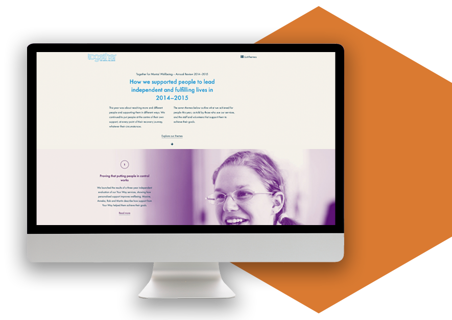
Together needed to showcase the charity’s hard work and success. The team required their annual reports, case studies, and organisation’s statistics, disseminated far and wide across digital platforms.
We created two annual reports, showcasing seven key areas, focused on Together’s annual achievements. This featured striking designs with eye-catching imagery and informative infographics. This made the content appealing and simplistic to read, ensuring user’s weren’t overloaded with statistical information.
Previously, these reports were paper-based and distributed across the UK. By changing to online means, we helped to spread the word further, and assist the company in being more environmentally friendly and cost effective.
Hex has a really good understanding of issues that are important to not-for-profit charity organisations, such as the need for information to be displayed in clear and compassionate ways.
Martin Fewster: Together Senior Communications Officer

Refreshing Together’s overarching website design and integrating bespoke API features
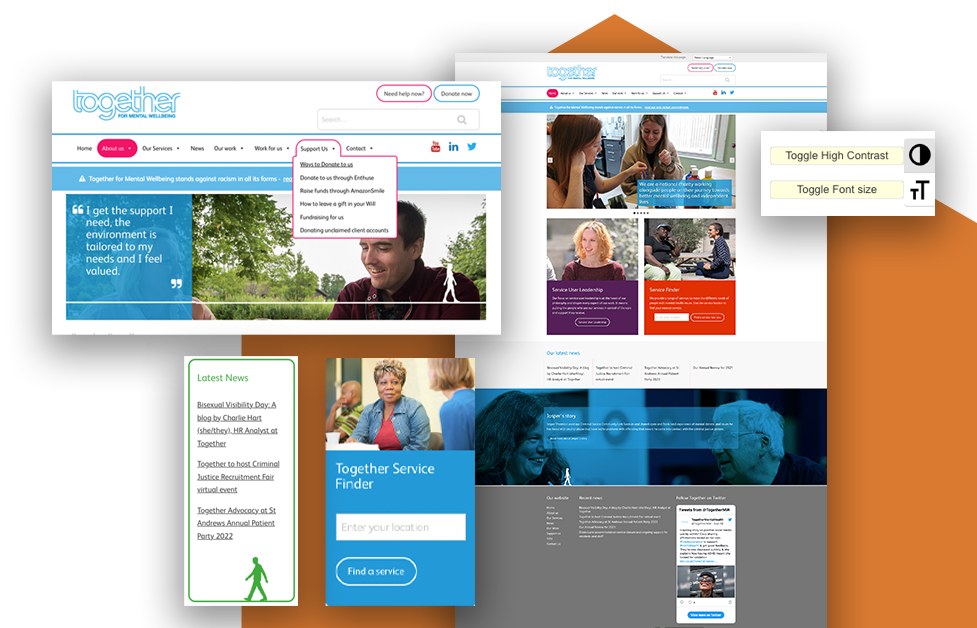
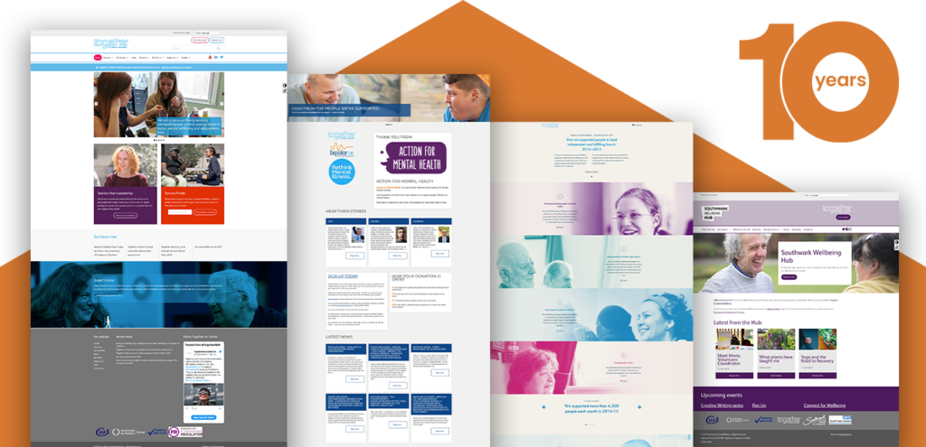
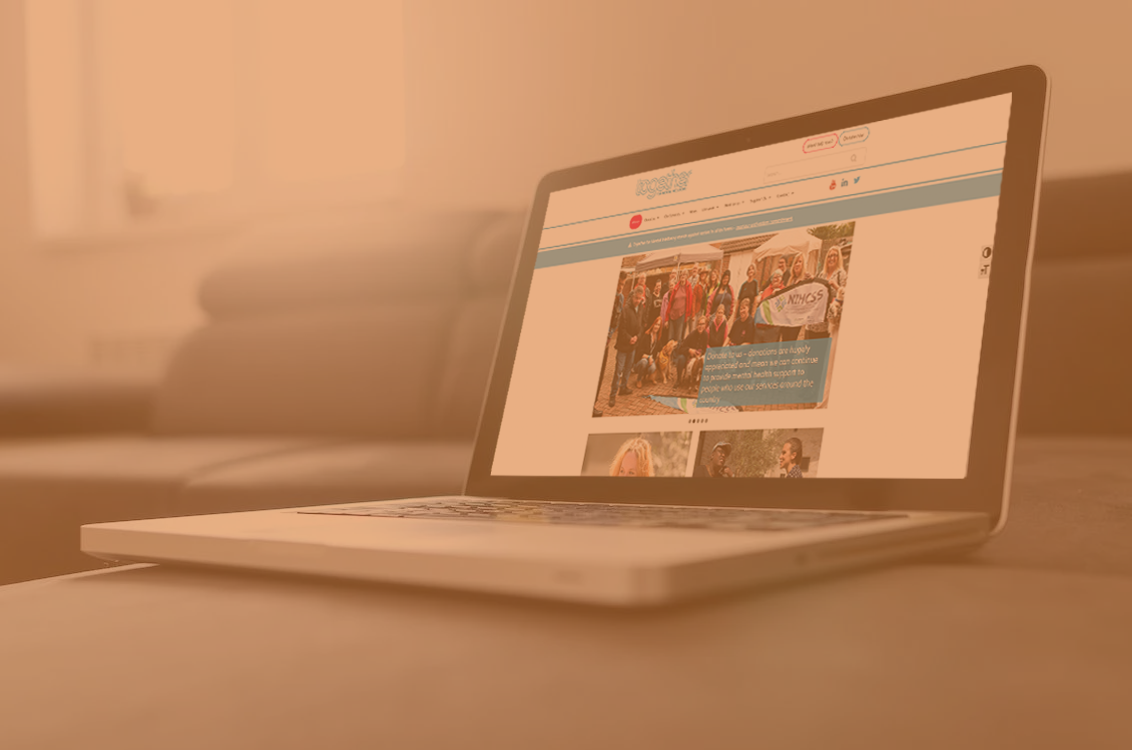
Impressed by our previous work, HeX had the pleasure of providing a visual refresh of the main Together website.
Working to Together’s branding guidelines, we modernised the platform.

Across the site, our developers:
- Increased the site’s width.
- Redesigning the primary menu layout.
- Implemented an array of attractive call-to-action features.
Whilst ensuring that their site met with Web Content Accessibility Guidelines (WCAG). Also, embedding additional accessibility features, such as the use of high contrast when on the site.
Implementing a unique service finder filter through WordPress
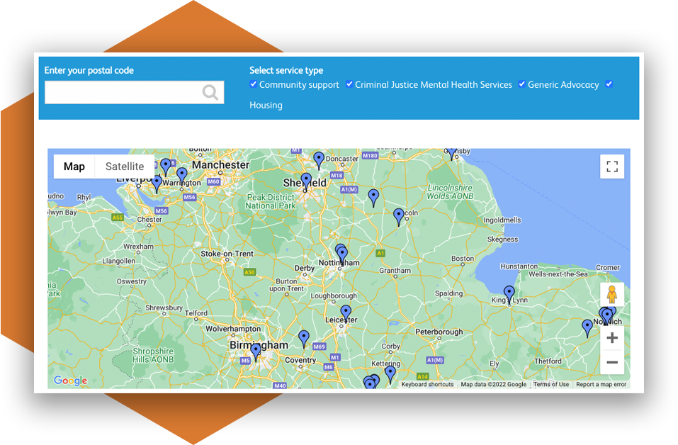
One distinct new feature embedding onto the website was a unique service finder. Expert developers integrated an Application Programming Interface (API) through WordPress. This custom post type is a location-aware building block, which features geographic-related data.
APIs allow applications to communicate with each other. We used this to pinpoint precise locations and display the results through an interactive map. This resulted in the directory allowing users across the UK to be able to search, filter, and explore services available for them.
Creating accessible health and wellbeing subsites
In 2020, HeX was enlisted to create a subsite for Together; the Southwark Wellbeing Hub.
We created this microsite to break down information. This made sure that the services displayed were relevant to the user. More so, it enhanced the editing experience for those maintaining the site. It did so, by not bombarding editors with overarching web pages that they were not responsible for updating. In turn, this created an easier and more simplistic Content Management System (CMS) for the teams to utilise.
This accessible Hub is the first point of contact for anyone worried about their mental health, or the wellbeing of someone they may know, in Southwark.
The service allows people to efficiently find the area of help and information that they need. We achieved this by implementing strong taxonomy and a clear, easy-to-use, site structure. All of which, has a striking and accessible design available for all to use, no matter what device or software they use.
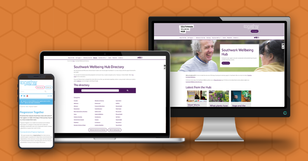
Our team integrated a bespoke Hub directory, signposting over 800 services for those in the Southwark area. This tool enabled users to enter keywords or filter down through categories in order to help find the support that best suited their needs.
This led to the creation of the Progression Together microsite. Offering assistance for those with complex and challenging mental health needs. This simplistic and effective site allows those needing support to swiftly search for accommodation services local to them.
Action for mental health through partnership collaboration
Our team then supported three leading national mental health charities; Together, Bipolar UK, and Rethink Mental Illness. Creating a site to demonstrate the accomplishments that the strong partnership working between the charities have achieved.
This site enabled the opportunity to share news and personal stories, along with a chance to gain donations and showcase what support this crucial money goes towards.
Upskilling Together’s Content Management System (CMS) knowledge
We understand the fundamental importance in empowering the teams that will be maintaining a site upon project completion.
We achieved this with the Together team by sharing our knowledge and providing hands-on content editor training.
Our expert accessibility consultants enhanced Together’s CMS skillset throughout this journey. This gave the team the confidence to maintain and update accessible additions to the web estate.
Future collaboration, Together
Today, HeX still provides an ongoing monthly maintenance package to provide support for the Together web estate.
It has been a pleasure working with the charity over the years and we look forward to hopefully collaborating again in the future.
More case studies about accessible wellbeing resources
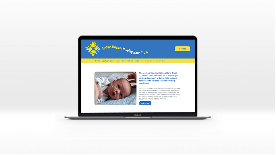
Joshua Hayday Helping Hand Trust
The web agency Bulletin approached HeX Productions for our accessibility expertise. Our team set to work developing an accessible website for one of their clients, The JHHHT.
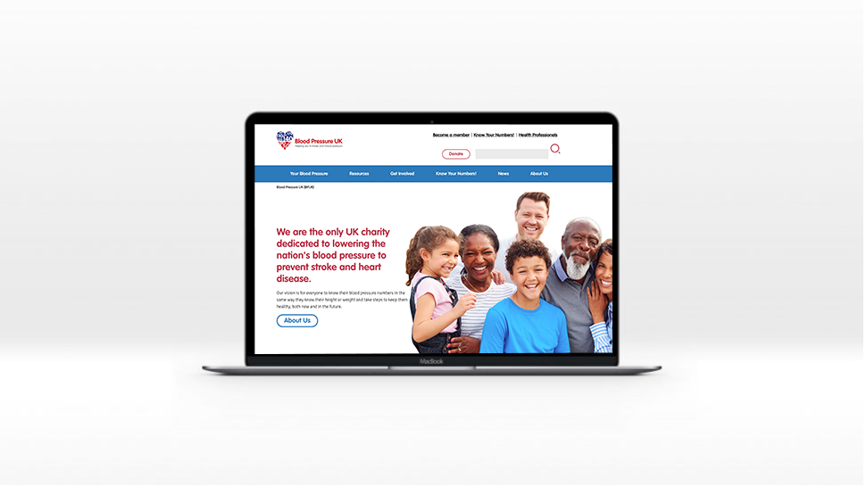
Blood Pressure UK
Blood Pressure UK required a complete redesign and redevelopment of their website. This involved transferring it to Terminalfour and ensuring it was mobile responsive, and fit the brand.

