Case study brief: Website accessibility audit testing for Future PLC publications
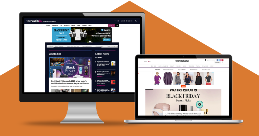
Woman & Home is an award-winning lifestyle magazine, which has been nearly running for an impressive 100 years. TechRadar is an online global publication, which helps up to 30 million people find and use the tech that they love.
HeX previously conducted accessibility audit testing across The Week and Kiplinger publications. Impressed by our service, Future PLC returned to our team for further audit testing of their fashion & beauty and tech publications. Working to WCAG 2.2, we made recommendations to make the magazines inclusive for everyone to access and enjoy.
The magnitude of the publications made this case study unique
The global magazine industry is worth billions of pounds. Most of its revenue comes from the adverts within its digital platforms. Often, these adverts are responsible for creating accessibility issues for many users to overcome.
Both the Woman & Home and Techradar digital platforms are jam-packed with adverts, third-party applications and an array of other features. Combined they host thousands of stories, news, deals, and reviews. Therefore, conducting an audit on platforms of this size is no mean feat. Luckily, our accessibility experts enjoy a challenge!

Key accessibility audit activities delivered
The HeX approach to website accessibility audit testing

We base all of our accessibility audit testing upon the most up-to-date accessibility standards. In this case, we audited Future PLC publications to meet Web Content Accessibility Guidelines (WCAG) 2.1 Level AA compliance.
To meet these web standards, our team initially ran automated software scans across the two platforms. This enabled us to seek out common accessibility errors which may be impacting users. We then performed manual reviews with the use of assistive technology, including utilising software and devices such as screen readers, voice control and keyboard only. Performing manual reviews helped us to not only discover further accessibility issues, but also aided our experts in assessing the user experience. Beyond this, web developers delved into the magazines’ backend to examine the coding. We collated all of these important findings, which presented digital barriers into a robust report.
Key accessibility audit testing discovery
Due to our meticulous audit testing process, our experts found an array of errors which would be impeding a user’s experience when navigating both platforms. These included:
Empty links and missing ARIA labels provided a lack of context for users
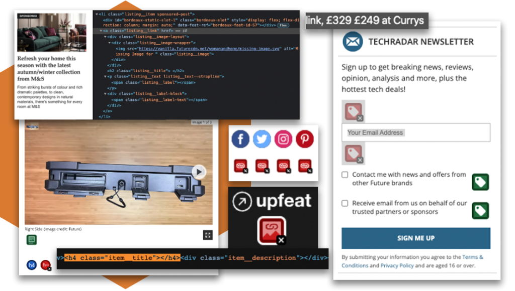
Empty links and headings or missing ARIA labels gave no context for screen reader users. In some cases, this presented people with text such as ‘opens in new tab’ read aloud by the screen reader, instead of the link direction.
Third-party integration left the HTML being non-descriptive on items such as alt text and social media embeds. This would leave blind people or users with no vision missing out on key information.
Missing ARIA labels made the search bar feature, which is certainly needed on large websites like these, impossible to use. Users were also left unable to sign up for items such as newsletters due to a lack of labelling. In turn, resulting in a frustrating and unequal experience.
Autoplaying features and page timeouts which may distress users
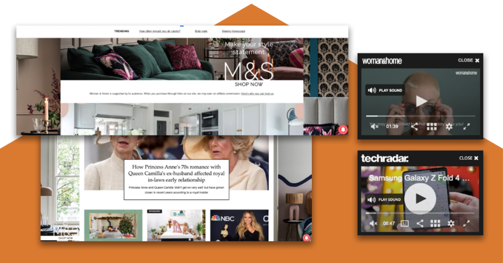
Carousel adverts had unstoppable motion and videos automatically played upon entering a page. Features like these could cause panic and anxiety for many users and should be disabled. Media controls were also lacking, preventing users from being able to stop items from playing.
Certain pages featured timeouts that made the web page refresh after just 60 seconds and without warning. Similarly to autoplaying features, timeouts can cause distress for users due to them preventing people from being able to complete actions in time, such as filling in an online form.
Low colour contrast ratios would leave users missing out on information

Low colour contrasts between background and foreground colours were insufficient in key areas. This would result in people with low vision from being able to read items. This was found on items such as offer codes and star ratings, impacting on the user experience.
Problems with keyboard accessibility
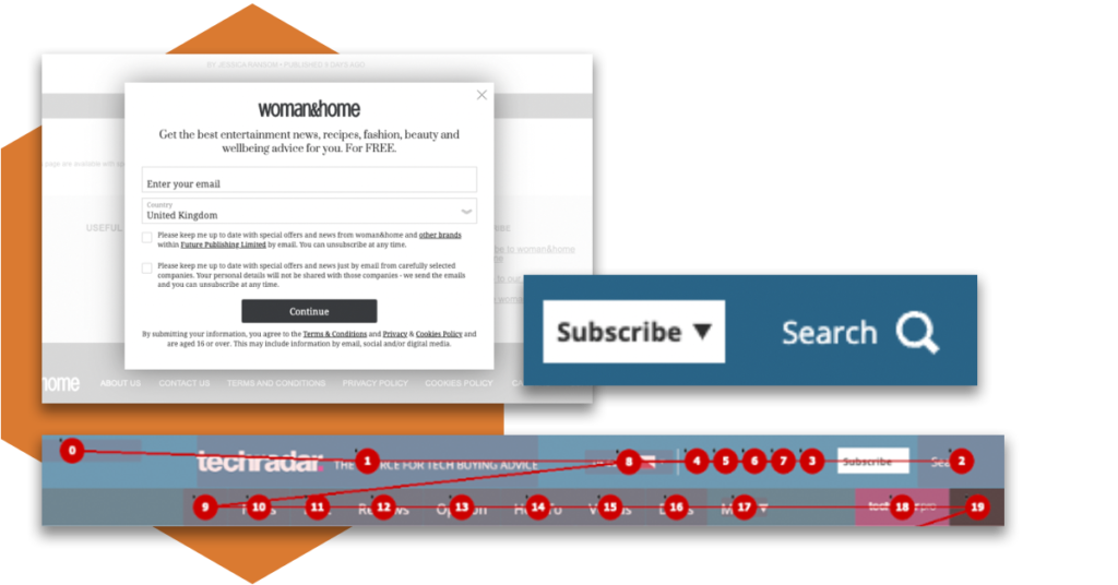
There was a lack of visible focus indicators when navigating through the platforms. This would result in keyboard only users being unaware as to whereabouts they were on a webpage. It was also discovered that focus orders when tabbing through were presented in a different order than intended. This would cause confusion for users.
Dropdown menus within the main navigation were inaccessible on a keyboard. Search facilities prevented keyboard only users from being able to navigate outside of the element once selected. Subscription popup adverts also made accessing the platform problematic. When presented with a popup, users were unable to bypass the adverts leaving them stuck. These keyboard traps would most likely result in users having to exit the platform altogether.
No skip links would leave users not being able to bypass menu items
There were missing skip links across both platforms. This would leave users having to navigate through multiple, repeated, long menus to gain access to their required content.
Presenting our findings to give a greater understanding of accessibility barriers

We created a thorough digital report for the Future PLC team with the discovered errors across their platforms.
This detailed report contained:
- The location of the accessibility errors.
- Screenshots of the issues presented to our developers.
- Why they were failing to meet web standards, which linked to specific success criterion.
- Suggested enhancements to aid with the user experience.
To give a greater insight into the effect of these findings for people with disabilities, we presented live demonstrations. With the use of assistive technology, we were able to give the team a unique perspective and deeper understanding about digital barriers. This enabled the team to see first-hand how the discovered errors may be preventing their publication’s visitors from accessing and interacting with their content.
The impact and result of accessibility audit testing
Our rigorous accessibility audit testing and comprehensive report created a roadmap of required changes for Future PLC.

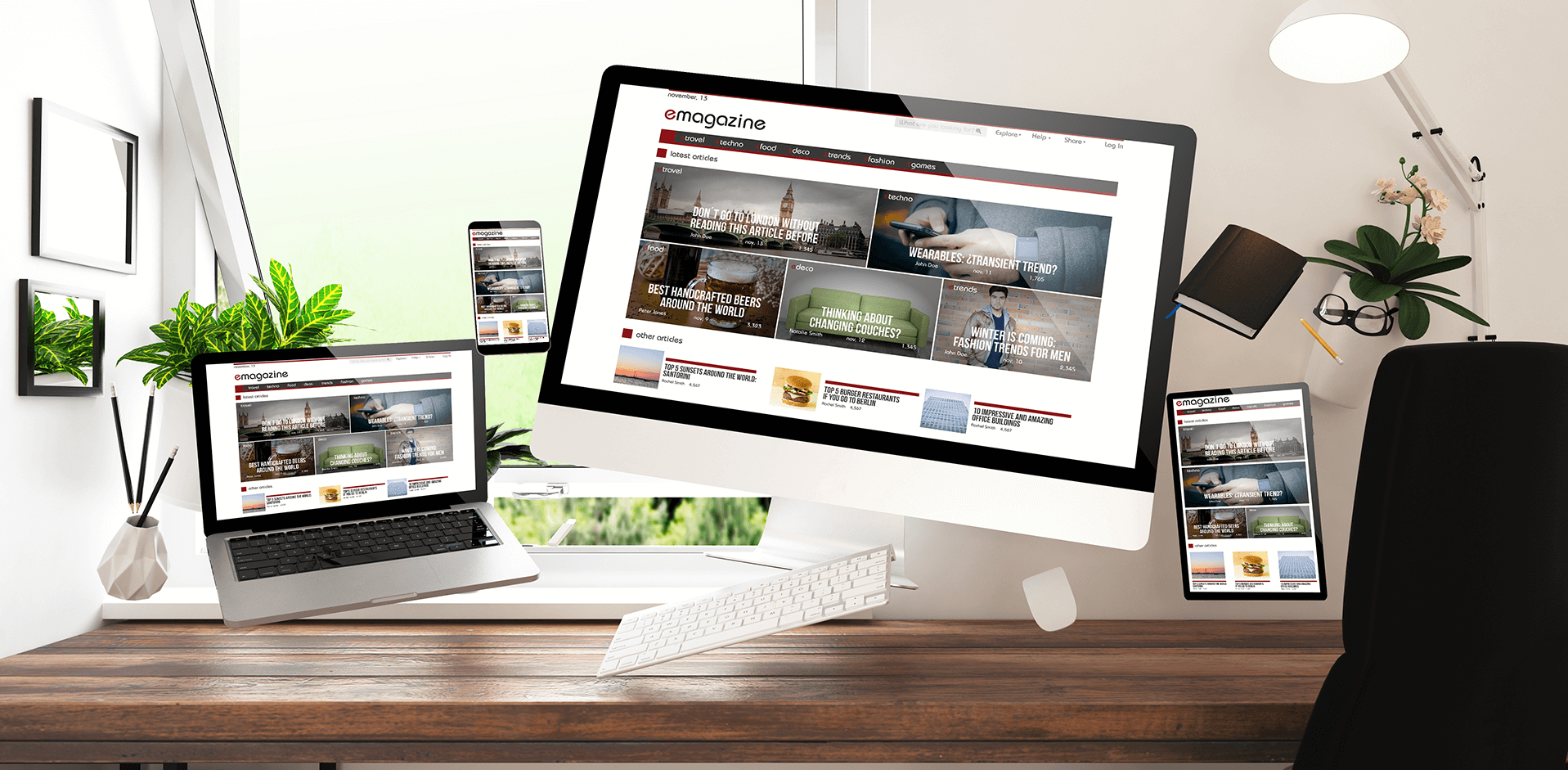
Due to our insightful demonstrations the team now have a deeper understanding on why these changes are so crucial.
Once these barriers are removed both platforms will conform to WCAG 2.1 standards. This will result in millions of the publication’s readers having equal access to lifestyle and technological news and deals in the Future and have a positive experience whilst doing so.
More case studies about accessibility audit testing

Accessibility audit testing for the University of Nottingham
After reading about our vast accessibility knowledge on an internet search, and due to our local connection, HeX was assigned the task of auditing the university’s website. The audit needed to seek out accessibility obstacles presented on their website to ensure it is inclusive for everyone.

Enabling global publications to become accessible
HeX conducted thorough accessibility audit testing to assess where accessibility barriers were present on ‘Kiplinger’, a Washington D.C publicist that provides business and financial advice, and ‘The Week’, who publishes distinctive online stories and reports on news from around the world.

