Case study brief: Accessible web design of the Health Equity Evidence Centre
Health Equity believes that everyone should be able to enjoy good health and the highest standard of healthcare. Partnered with NHS England East of England, they required the build of a robust digital Evidence Centre.
HeX fought off fierce competition, due to our strong reputation whilst working with one of Health Equity’s collaborations, Queen Mary University of London. Securing the contract, our team inclusively designed and developed a data-driven and user-friendly digital space.
This platform generates innovative insights for addressing inequalities in and through primary care.
Bringing data to life with visualisations made this case study unique
The Health Equity Evidence Centre holds a vast array of complex data. Therefore, it was crucial that evidence-based information was clear and easy to understand for users. Through striking graphical visualisations these help to guide website visitors through key intelligence findings. These have helped to give a granular understanding on informed solutions for equitable health and care.
All of which has been built to meet Web Content Accessibility Guidelines (WCAG) 2.2 Level AA standards. Ensuring users can access and interact with the Evidence Centre, providing an equal experience for all.

Accessible design and web development action
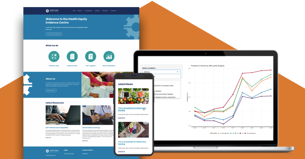
Accessible web design with strong taxonomy and eye catching iconography to guide the user flow
Our expert graphic designers set to work mocking up a series of wireframe design prototypes. These designs allowed the team to identify a streamlined route for users to easily flow through the platform. Using Health Equity’s brand guidelines, we integrated distinct aesthetics to reflect the organisation’s values and tone. This created a clean and modern platform, built with usability at its core.
To achieve this, the team devised a taxonomy that drives users on a journey through the evidential information. Building the platform in WordPress, enabled the incorporation of a range of enticing call-to-action blocks. These blocks and the use of standout iconography, provide clear signposting of data and resources.
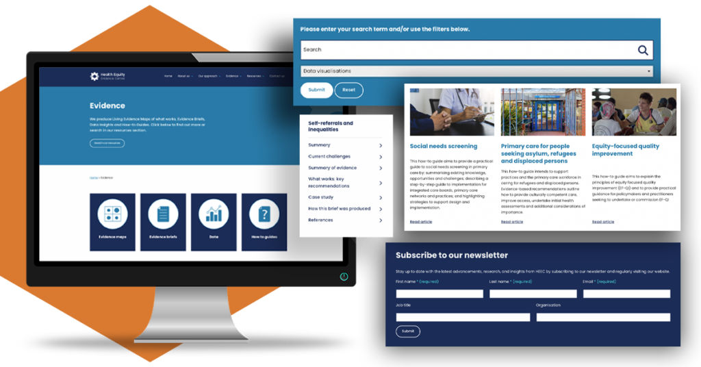
Through the categorisation of resources, a powerful search and filter element has been embedded, allowing users to navigate directly to the data they are seeking.
To strengthen the user flow further, additional summary menus are available at the beginning of web pages. These let users instantly recognise what key findings are available in that location. With a useful breadcrumb trail also supporting wayfinding.
Creation of striking, user-friendly data visualisations
The Evidence Centre has a prevalent array of complex and technical data throughout the platform. A challenge for our developers was in the creation of data visualisations. Graphical evidence not only needed to be accessible, but also easy to maintain for Health Equity.
Graphic designers created a range of accessible line, bar, scatter and bubble graphs. Whilst HeX’s Front-end Developers crafted bespoke data explorer elements. Together, enabling users to filter through items such as location, dates, and conditions. In turn, feeding back accurate results in a visually informative and user-friendly way.
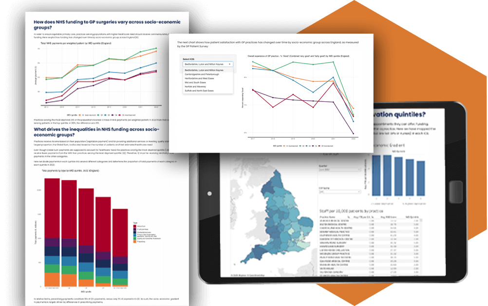
To assist Health Equity in maintaining graphical evidence, we manipulated coding to create unique WordPress blocks. Developing multiple visualisation styles, with the Health Equity team not needing prior knowledge of coding to update the data. This allows Health Equity to easily generate evidence from their own system. Not only that, but these blocks can be reused to contain a variety of new data sets on any location site-wide.
Impact and results from the accessible web design and development of the Health Equity Evidence Centre
The new evidence-informed hub for equitable health and care is both simplistic to navigate and use.

Bespoke expert coding has enabled users to swiftly locate key information. Presenting explorable data through a variety of attractive, accessible, and informative methods.
As equality is fundamental in Health Equity’s work, accessibility is of primary importance. Being experts in the field, our team has helped Health Equity to achieve a compliant website. This meets Web Content Accessibility Guidelines (WCAG) 2.2 Level AA standards. Resulting in all users being able to interact with and access key data, no matter what device they may use. An accessibility statement has also been created to further support users when online.
Since project completion, Health Equity has received upskilling Content Editor Training. This has empowered the team with the confidence and skills needed to keep their platform and evidential-data up-to-date. More than this, the team knows how to do so in an accessible way.
Health Equity now has a sleek and modern, responsive platform, with usability at the forefront. We look forward to continuing our work together, on the next exciting phase of this development project.
More case studies about accessible web development
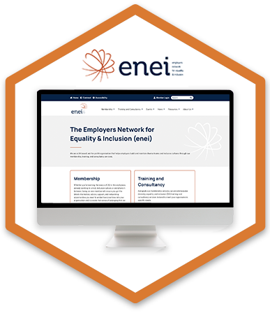
enei
The Employers Network for Equality & Inclusion came to HeX in need of a new accessible website and creation of a unique member’s area, giving access to a range of exclusive content.
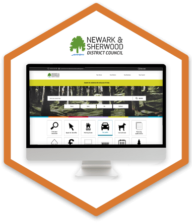
Newark & Sherwood District Council
Impressed by our expertise, Newark & Sherwood District Council procured our services to perform a complete overhaul of their main website to meet government accessibility standards.

