Case study brief: NUH Life web design and development
NUH Life is a not-for-profit organisation, based at the Queen’s Medical Centre in Nottingham.
The NUH Life facility offers a wide range of diagnostics, treatment, counselling and support services. This treatment is for both NHS and privately-funded patients, who are in need of fertility specialist support.
After hearing a gleaming recommendation about HeX, Nottingham University Hospital (NUH) got in touch with our team. NUH were in need of an accessible website to ensure that their current and future patients could all gain access to the incredible services that they provide.
Providing life-changing accessible information made this case study unique
Set up in the 1970s, HeX’s hometown of Nottingham was one of the first sperm banks in the country.
With many NHS sperm banks closing over the years, it was crucial that patients from across the UK could receive the support and services on offer.
Our team achieved this by designing and building the NUH Life and Nottingham Sperm Bank websites with accessibility at the forefront. Both meeting with Web Content Accessibility Guidelines (WCAG 2.1) Level AA Success Criterion.
Web development activities delivered
- Website design work
- Web development
- Delivering Accessibility Content and Editor Training
- Project management and accessibility consultancy
- Website hosting on our UK-based servers.
- Ongoing monthly support for website maintenance and providing online security.
Creating an accessible user journey through consultancy

At HeX we understand the importance of understanding our client’s audience and vision for their website. We did this, by working closely together through each iterative phase of the design and development process. This ensures that we reach the desired website goals, aesthetics, and site functionality.
HeX has worked on a range of healthcare websites previously, such as:
With this experience, we knew the type of layout and navigation that would be most beneficial for the users.
At an early stage in our consultancy, we planned and created an accessible user journey. This involved mapping out a clear hierarchical site structure. We implemented strong taxonomy, with clear call-to-action features into our plans. All with the aim to streamline and signpost users to key content areas.
Using site mapping to create a simplistic wireframe prototype

Wanting to use their funding for the website build, NUH came to us armed with just a name, logo, and a general idea of the look and feel they were hoping to achieve.
Without having initial branding guidelines meant that our graphic designer had a blank canvas to set to work on. Using the sitemap agreed upon in the consultancy phase, our design team began to sketch out website wireframes.
Wireframing takes place before adding additional styling. They are simplistic line drawings that provide a visual representation of a website’s navigation, layout, and features. This design process enables a fast moving and agile build.
Once the design phase was complete, the website development commenced.
Turning designs into streamlined navigation
Both websites are WordPress builds; a content management system which HeX are experts in utilising. Using our own bespoke accessible theme, we implemented Gutenberg blocks throughout the site. This feature has become best practice for builds, allowing a more visual and intuitive way of adding and editing content on a site.
With users navigating through a series of signposted information, clarity on the journey was essential.
Using strong taxonomy we provided a clear pathway for the user’s journey throughout the websites. Our experts embedded clear top navigation bars and key page breakdowns to guide the user through the site with ease.
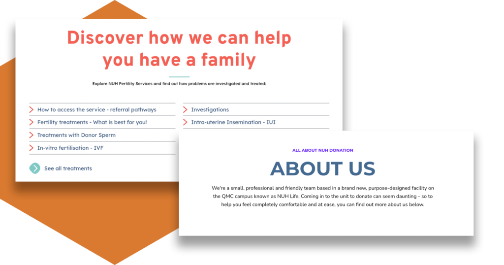
Main content pages contain clear summary boxes, detailing what information lies within each section. These boxes help to reduce cognitive load amongst individuals and can assist those short on time with page navigation. Summary boxes both aid in navigational flow and enhance a website’s Search Engine Optimisation (SEO).
The power of inclusive design to aid in intuitive user flow
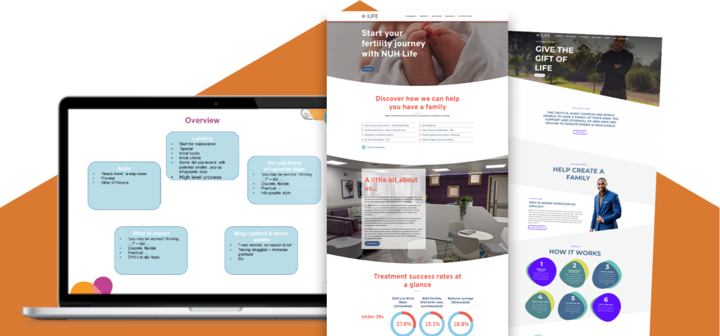
We all like to see striking and aesthetically pleasing websites. This can be achieved through the right choice of colours, shapes, and a modern, sleek, look and feel – as demonstrated in these examples. However, design can be used to achieve much more than this!
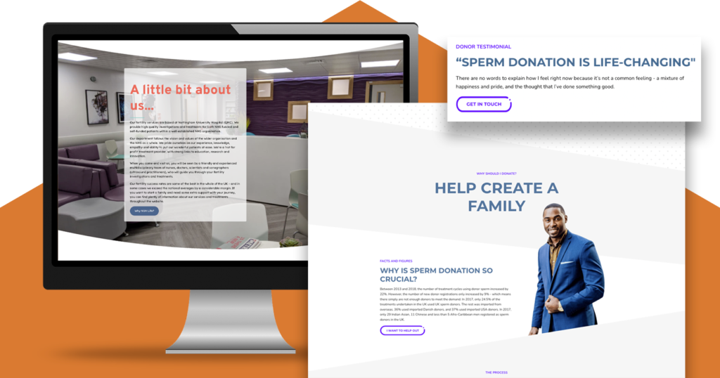
It was essential with these websites that the user understands the services that NUH provides, and what treatments are available. Through design, we could lead the user on a journey by talking them through the process and guiding them to information relevant to them.
We accomplished this with features such as stand out testimonial elements. Each testimonial box serves as a navigational tool, acting as an enticing guide for the user.
Our developers used an array of colourful imagery and tables to provide simple walkthroughs on varying processes. Features that helped to enhance the user’s experience.
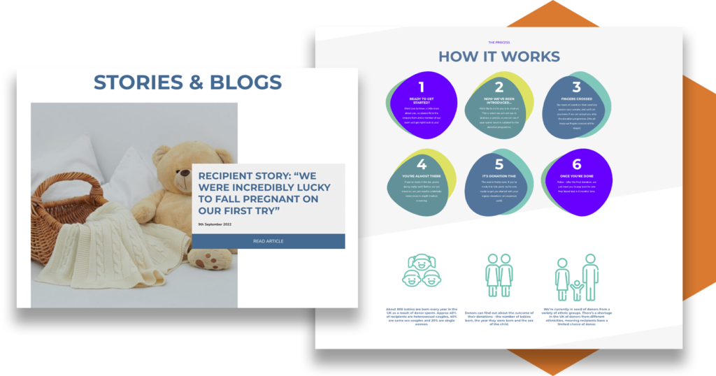
Implementing eye-catching categorisation blocks to help convey the importance of fertility and donation services. These aided in assisting the user navigate to key site elements and providing a clear user-journey.
Integrating online elements to interact with the user
Embedding accessible online forms
One main request from NUH was the requirement for their users to be able to access and complete online forms. By doing so, this made it a more streamlined and efficient process for the user, and helped in removing some administrative tasks for their staff.
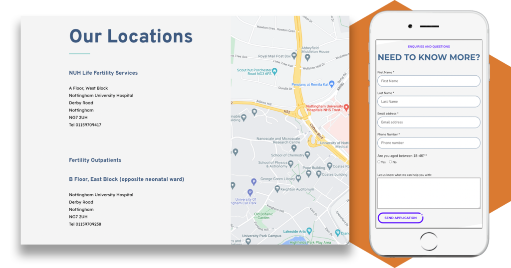
Implementing Google Map integrations
The need for online users to be able to easily locate NUH clinics was essential.
HeX expert developers integrated an accessible map function into the website’s coding. This feature enables all users to be able to find the precise location of the Nottingham-based clinics.
Creating accessible statistical data features and tables
Encouraging people to donate was a big aspect of this project. The use of statistical data and key facts needed to stand out to present information in an encouraging and easy-to-understand way.
Generally speaking, tables and data are often difficult to represent in an accessible way. However, our accessibility experts have not only achieved this, they have done so in an engaging and user-friendly way.
With elements that interact when hovered over, enlarging this text for the user, whilst still working with assistive technology devices. Along with elements such as treatment success rates, which will always remain up-to-date.
NUH Life project outcomes
Through a structured site breakdown and creating simplistic signposting, we have constructed a clear user journey. Through powerful design and strong taxonomy the websites provide both an engaging and informative online experience for its users.

Both of the NUH Life websites are now Web Content Accessibility Guidelines (WCAG) 2.1 Level AA compliant.
A disabled team of website testers at Shaw Trust Accessibility Services, who we work in partnership with, have assessed the website’s accessibility. This has been done by utilising a range of different assistive technology software and devices. In turn, ensuring that the incredible services that NUH Life provides are accessible for all.
Prior to project completion, our accessibility experts provided in-depth training to those responsible for maintaining the website. This involved teaching their team how to add content to pages using the bespoke site blocks and how to implement accessible content using the back-end of the website. This training left the team with the confidence to keep their site updated and accessible in the future.
We continue to support the NUH Life by providing an ongoing maintenance package. This maintenance ensures that their website remains up-to-date and secure. Meaning that any new functionality or features that emerge are swiftly implemented.
More case studies about accessible web development
Wiltshire Service Users’ (WSUN)
WSUN required an Autism Hub building, linking to their main website. The Hub needed to create accessible information for those with autism, their families, and carers.
Genius Within
Due to the large number of Genius Within’s users being neurodivergent they required a re-design and re-development of their website, with a user-focused approach.

