Case study brief: Creating a personalised digital prospectus for Queen Mary University London
The way students received course information at Queen Mary University London needed to be re-invented. A new groundbreaking user experience for potential students, combining all the information they need to make their decision into one handy pdf download.
HeX revealed this innovative product in a matter of weeks, from conceptualisation to finalisation.
HeX had worked with QMUL in the past, providing web support and demonstrated knowledge of the web estate and the Funnelback course finder.
The use of cookies and scripts to create a groundbreaking prospectus solution made this case study unique
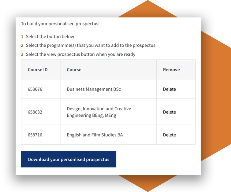
Using cookies and scripts, a prospectus solution was devised to supply the right information to users. Students were free to browse courses via the Funnelback course search adding relevant courses to their prospectus. Courses that students had added to the prospectus were stored in web cookies, allowing the site to store the data of what had been selected. Specific course and school information stored in the cookies was pulled in alongside existing designs about University Life, the student community, accommodation pages and university information using lines of code called scripts. All of the information was made available in web format and supplied as a pdf download.

Design and development activities delivered
- Design work
- Development work
- Project management and accessibility consultancy
- Ensuring their prospectus met with WCAG 2.0 standards
Streamlining the user journey
Students had difficulty navigating and remembering the 96 undergraduate courses that QMUL offers. To compare courses, students would have to bookmark and cross reference courses with each other, navigating to different pages each time.
Printed prospectuses being offered by the university were large, with in depth information about each of the 96 courses. Potential students required a way to access the content they desired, without being overwhelmed by non-relevant course and school information. The user journey was to be shortened through mapping, allowing for only chosen courses to be included in a digital downloadable prospectus.
The digital prospectus would allow each course to be detailed in full, providing information on the modules, learning points and the potential career prospects upon graduating. A fully bespoke digital prospectus that could be downloaded immediately.

HeX were chosen to take on the concept with a user-first approach, ensuring the process simplified the prospectus journey, using our knowledge of Terminalfour content management system and Funnelback course search.
Creating an automated process for digital personalised prospectuses
A digital prospectus was designed for printing purposes. This detailed every school and course available at QMUL. Information for students is stored in a number of locations on the website. Website page content exists providing information on what each school has to offer a student. Course information exists and is displayed as website content within the schools that offer the courses. These courses can be searched for using the course finder. Each piece of content is considered a data set, containing text and images.

To produce a personalised prospectus, each piece of data needs to be sourced from a different location on the website and from within the library of digital design assets for each page of the entire prospectus. In order to provide the student the capability to pull all of the information together, a number of strings of code, called scripts, had to be processed at the same time. Much of the process was managed using cookies. A cookie allows the website to pull a specific piece of information from where it is stored, and display it for use.
Once there is a list of information, another script can then serve that information to the user, creating a page of content relative to what the student wants to see. Removal of items from the list is also managed using cookies. The relevant digital designs are then identified from the library and the information added to the list to be displayed.
This unique process gives the student everything they need, all in one place.
Finally all of the information identified is converted from a web format and displayed in a pdf format. The digital prospectus was delivered in iterative stages to the QMUL management team, allowing for staged sign off. A wireframe and design of the digital prospectus was delivered, allowing web teams to review. A prototype was then developed on a live development environment, providing opportunity for key stakeholders to review before it was built. The new system was built using innovative solutions never before implemented by QMUL.

Innovating future technology for digitised personalisation of content
The automated process meant that prospectuses could be downloaded immediately, increasing user retention and user interest in the university.

The solution made the user feel valued, by providing a prospectus that was bespoke to their requirements.
QMUL understood the financial and logistical challenges of printing thousands of prospectuses and sending them directly to students. This solution removed that burden, allowing students to download prospectus at no extra cost to the University.
This revolutionary digital prospectus infrastructure is able to be extended far beyond one year, with only minor additions, it can be replicated for many years to come – dramatically reducing the workload of producing brand new prospectuses from scratch. This allows the university to focus on areas of priority for coming years, without having to be concerned about the prospectus process.
This was an MVP (minimum viable product) iteration, meaning that other features could be built into this creation such as ‘Recommended courses’ based on potential students’ current selections.
More case studies about accessible design

Pearce and Dale
Pearce and Dale needed an online platform to be able to showcase and list vehicles for sale in order to attract a wider audience.

SMC Design
SMC Design approached HeX with a need to revitalise their outdated brand and wanted a fresh new website to showcase their services.

