Case study brief: Designing Together's Annual Review
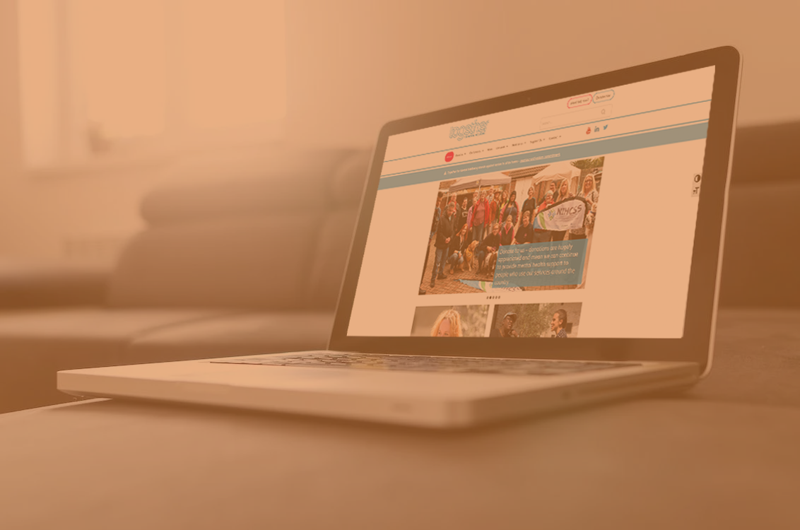
Together for Mental Wellbeing provide a variety of support to help people deal with the personal and practical impacts of mental health issues.
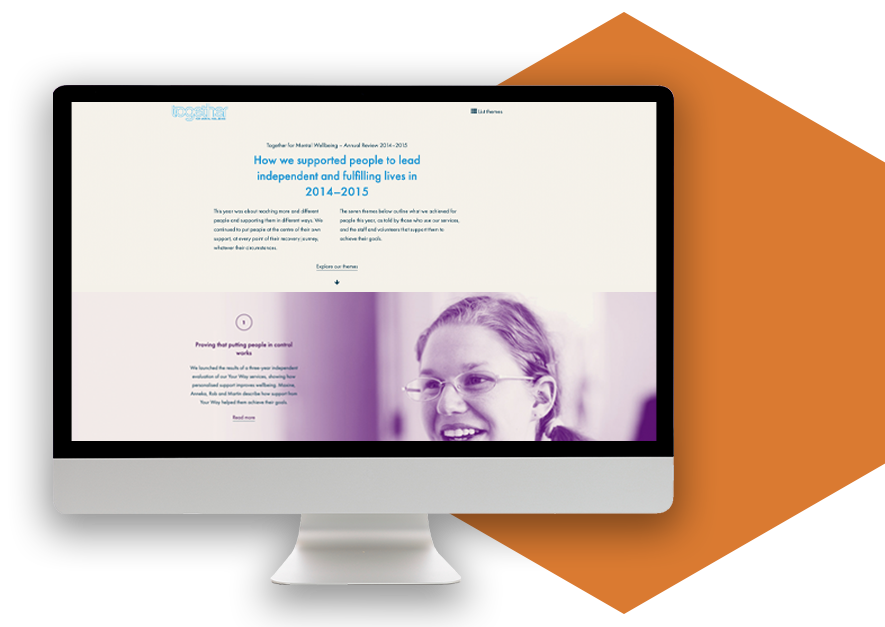
At the end of 2015, we helped provide an easy and accessible way for Together UK to showcase their annual review of the year.
HeX's striking design work made this case study unique
We worked with Chris Allwood (www.cdja.co.uk) who was responsible for the design, leaving us free to dedicate time to the production and installation of the page and also to work on the infographics and images to be featured online.

Web development activities delivered
- Web design
- Web development
- Project management
Presenting statistical data in attractive formats
Together aimed their year at reaching more and different people, supporting them in different ways, and putting people at the centre of their tailored support.
We outlined seven key areas to showcase what Together achieved for people throughout the year, as told by the people who use their services, and the staff and volunteers that supported them in their journey.

Take a look at what we produced here: www.together-uk.org/ouryear/

Design impact and outcomes
We wanted the page to be easy to read and provide all the relevant information in a clear, sophisticated style. The use of images, large tiles, and dropdown links to more information makes the content easy to read, simple to understand and more appealing to look at than a PDF document full of figures.

More case studies about web design and development

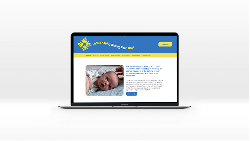
Joshua Hayday Helping Hand Trust
The strategic communications agency, Bulletin, approached HeX Productions for our accessibility expertise. Our team set to work developing an accessible website for one of their clients.

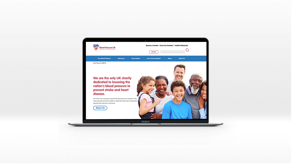
Blood Pressure UK
Blood Pressure UK required a complete web redesign and redevelopment, transferring it to Terminalfour and ensuring it was mobile responsive, and fit the brand.

