In light of the recent WebAIM Screen Reader User Survey, we explore key result findings and ways to ensure your website is accessible and user-friendly for screen reader users.
In the UK alone, there are over 2 million people living with sight loss. People who rely on assistive technology in order to access online information, services, and for means of communication. In particular, the use of screen reader software is an essential tool in the digital world.

Who uses screen reader software?

Although website visitors who are blind are predominantly the main users when it comes to screen readers, anyone may choose to utilise this software.
This includes people who:
- Are visually impaired
- Have a cognitive or learning disability
- Are Deaf or hard of hearing
- Have motor difficulties
- Are learning a language
Even someone who may just have eye strain from looking at a screen for too long may seek an easier way to digest content through having it read aloud to them.
How a screen reader is used online
Screen reader software, such as JAWS, NVDA, and VoiceOver, does what it says on the tin. It reads aloud content displayed on a screen; whether on a desktop computer, laptop, tablet, or via a mobile phone. In some cases the software can also be used to translate content into Braille or sign language.
Once setup, screen readers will recite:

- Web page content
- Social media posts
- Digital documents
- Alt text on imagery
- Alerts and popup adverts
- Navigational elements, such as links, menus and buttons
Basically, anything that is displayed on a screen.
The need for digital accessibility
Over the years, we’ve seen a lot of progression when it comes to both technological advances and accessibility. However, unfortunately, there is still a staggering amount of platforms that are inaccessible and present barriers to users of assistive technology. Not only will an inaccessible website give a poor and frustrating user experience for people who are navigating a platform or using online features, but it can actually prevent some users from accessing a site altogether.

These online obstacles led to:
- Only 33.4% of WebAIM survey respondents, who have a disability, believing that the web has become more accessible.
- 85.9% stating there is still a vital need for better, more accessible, websites.
Results also found that many inaccessible platforms go unreported, with 44.3% saying they don’t often report websites and 21.7% never doing so. Though there are some organisations out there who sadly don’t prioritise digital accessibility or their users, there may be others who are unaware of the impact and experience that they are providing. Therefore, it’s important to make a report and let businesses know if that’s the case.
Most common accessibility barriers for screen reader users
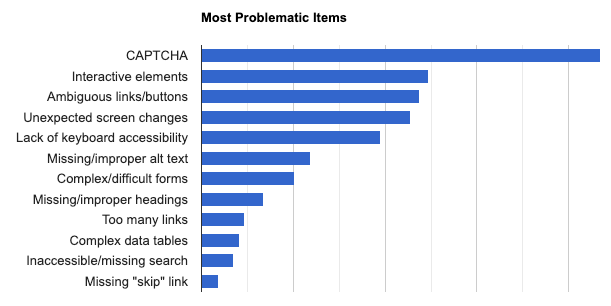
Below are the most problematic issues raised in order through WebAIM’s latest survey for screen reader users and a range of inclusive guides that can help to remove these issues:

- CAPTCHA items being present. These are images that are presented as text, needing verification to prove that you aren’t a robot. Often, these are barely legible for sighted users and can also cause confusion and panic for people with cognitive disabilities. However, for blind or visually impaired users, they are completely inaccessible.
- Interactive elements like menus, tabs, and dialogs not behaving as expected.
- Inaccessible buttons and links not providing context for users. For example, stating ‘click here’ instead or giving a description of where the user will be directed.
- Screens or parts of a screen that changes unexpectedly.
- Lack of keyboard accessibility, leaving users unable to access website elements.
- Images with missing or improper alt text descriptions. Resulting in an unequal experience and users being shut out from visual information.
- Complex or difficult forms. This can result in users not completing important online information or being able to create profiles or complete purchases.
- Missing or improper headings levels. 71.6% of users stated they use headings to navigate through content, so heading levels that aren’t correctly structured would prevent them from effectively doing so.
- Too many links or navigational items causing confusion for users.
- Complex data tables leaving users missing out on information.
- Inaccessible or missing search functionality.
- Lack of skip to main content or skip navigation links, allowing users to bypass website elements such as large menu items.
Ways to eliminate screen reader website accessibility barriers

Along with reading supportive guidance to remove the 12 issues highlighted above, there are further ways to eliminate online barriers and assess the accessibility of your platforms:
- Work alongside Web Content Accessibility Guidelines (WCAG)
- Perform routine accessibility checks, using tools such as WAVE
- Take a free website accessibility health check
- Undertake automated, manual, and technical audit testing
- Have web development work performed to become accessible
- Sign up for upskilling inclusive training
- Get in touch with our experts for accessibility consultancy to guide you through the required inclusive changes for not only screen reader users, but all digital visitors.
