Last month, a series of new additions were announced to the Web Content Accessibility Guidelines (WCAG). This blog explores what you need to implement to remain compliant with web standards under WCAG version 2.2.
Though the majority of WCAG remains the same as version 2.1, there are nine new success criteria in the Web Content Accessibility Guidelines (WCAG) 2.2. Now is the time to familiarise yourself with these changes and begin to implement them across your websites and apps.

What are Web Content Accessibility Guidelines (WCAG)?
Web Content Accessibility Guidelines (WCAG) are internationally recognised standards that explain the requirements for digital platforms to be accessible for all users.

This includes designing for people with disabilities. Covering:
- Visual: people who are blind, have low vision, or have a colour deficiency.
- Auditory: people who are Deaf or hard of hearing.
- Neurological: people who struggle to use a mouse or a keyboard.
- Cognitive: people with dyslexia, autism, or who have learning difficulties.
Ensuring that users who rely on assistive technology devices and software, such as screen readers, keyboard only, screen magnification or voice activation, have equal access to an online platform’s information and services.
WCAG conformance is measured using three levels that define the success criteria. These are marked at Level A, AA, or AAA. In the UK, services must achieve Level AA to meet government accessibility requirements.
What’s different from WCAG 2.1
The nine new Success Criteria are:
- 2.4.11 Focus Not Obscured (Minimum) (Level AA)
- 2.4.12 Focus Not Obscured (Enhanced) (Level AAA)
- 2.4.13 Focus Appearance (Level AAA)
- 2.5.7 Dragging Movements (Level AA)
- 2.5.8 Target Size (Minimum) (Level AA)
- 3.2.6 Consistent Help (Level A)
- 3.3.7 Redundant Entry (Level A)
- 3.3.8 Accessible Authentication (Minimum) (Level AA)
- 3.3.9 Accessible Authentication (Enhanced) (Level AAA)
2.4.11 Focus not obscured (Minimum) (Level AA)

Some users, when online, need to use a keyboard instead of a mouse to navigate a website. When doing so, users need to be able to see where they are on a web page when using the tab key to skip through interactive elements.
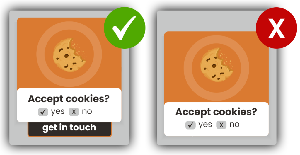
Items such as links or buttons must now have a keyboard focus that is at least partially visible. The problem where this often occurs is when features such as sticky footers, cookie banners, or floating menu bars, obstruct website elements. When this occurs, the keyboard focus disappears, resulting in navigation being impeded for many users. This new success criteria will help to remedy this accessibility barrier.
2.4.12 Focus Not Obscured (Enhanced) (Level AAA)
If working to WCAG Level AAA, the difference between this and Level AA above is that the keyboard focus state now needs to be fully visible.
2.4.13 Focus Appearance (Level AAA)

Previously, there has been a requirement with WCAG to have a visible focus on website elements when active. A focus indicator needs to have a visible difference, such as a colourful border, to let users know where they are as they move around a platform.
Until now, there has not been a defined rule on the sufficient size and contrast that focus indicators need to be set to.
To make sure that users can see when an item is in focus in Level AAA, the focus appearance has to:
- Be at least as large as the area of a 2 CSS pixel thick perimeter of the unfocused component or sub-component.
- Have a colour contrast ratio of at least 3:1 between the same pixels in the focused and unfocused states.
2.5.7 Dragging Movements (Level AA)

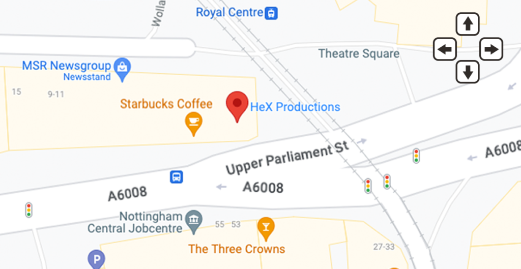
People with physical and neurological impairments can find using a mouse to select and drag website features problematic or even impossible. An example of this would be when using an interactive map element, where users would need to drag in a direction on the map to be able to move around.
Any action that involves dragging a mouse or touchpad for movement requires an alternate option presenting, which allows the same functionality. This could be achieved by providing a single pointer or allowing the user to perform tasks through a simple click of a button. For the above example, this would need directional arrows for users to be able to select where they would like to navigate.
2.5.8 Target Size (Minimum) (Level AA)

People who have difficulty with fine motor skills or have low vision can find selecting small targets a challenge when online, resulting in users activating wrong targets in error. This is especially the case when targets are in close proximity to each other.
To aid with accessibility, WCAG 2.2 has introduced a target size test minimum requirement for interactive elements on a web page to be 24 by 24 CSS pixels wide. We’d recommend still making these larger and ensuring adequate spacing in between.
An exception to this rule is if there is an equivalent alternative on the web page which can achieve the same function.
3.2.6 Consistent Help (Level A)
Many websites have useful help facilities on their platforms to assist website visitors if they face a problem. Whether through contact details, live chat features, or FAQ guides, if you have them on your platform, they would be much more helpful if they were located in the same place sitewide. Not only will this enhance the user experience for everyone, but it will also reduce cognitive load for neurodiverse users.
3.3.7 Redundant Entry (Level A)

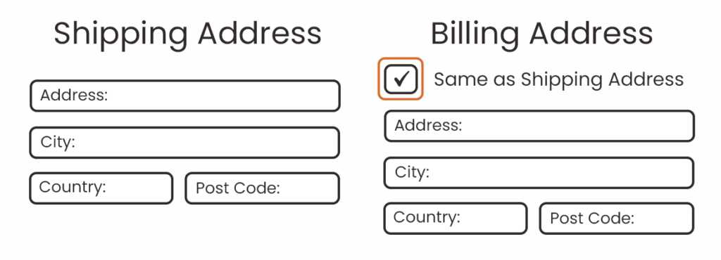
Entering repetitive information on a website can be a frustrating experience for everyone. For users with cognitive disabilities, who may struggle to remember what information they have entered previously, this can also lead to anxiety. By ensuring information can be auto-populated or have a selectable drop-down with previous inputted data, makes sure that users don’t have to enter the same information again during the same process.
An exception to this rule is when the information is essential, such as for security purposes or the previously entered information is no longer valid.
3.3.8 Accessible Authentication (Minimum) (Level AA)

Some people struggle to solve puzzles, memorise information like usernames and passwords, or find it difficult to retype one-time passcodes. This success criteria is all about removing cognitive function tests to be able to login, unless that step provides at least one of the following:
- An alternative authentication method.
- There is a tool available to assist the user in completing a cognitive function test.
- The cognitive function test is to recognise objects.
- The test is to identify non-text content that the user has provided.
Removal of cognitive functions tests will simplify the authentication process for all users.
3.3.9 Accessible Authentication (Enhanced) (Level AAA)
The difference between Level AAA and AA for Accessible Authentication is it does not have an exception for object recognition and personal content. An example of this would be if your platform has a reCAPTCHA for image selection.
What has been removed from WCAG 2.2
4.1.1 Parsing has now been removed from WCAG 2.2. This is due to it being outdated because of changes in the HTML standard. In WCAG 2.1 and 2.0 this Success Criterion should be considered as always satisfied for any content using HTML or XML.
Need help in implementing Web Content Accessibility Guidelines (WCAG) 2.2 changes?
If you need any help or advice in implementing the new changes to the Web Content Accessibility Guidelines (WCAG) 2.2 on your digital platforms, get in touch with our team. We can offer web development services, accessibility consultancy or training for your own web developers.
