Inclusive design means creating websites, applications, browsers, tools, and every other digital product in a way that ensures all users receive an equal experience.
In this modern day, a large portion of our everyday life centres around the use of the internet. Over the festive period, I’m sure we’ve all spent quite a bit of time surfing the net, whether shopping for gifts, ordering groceries, staying in touch with family, or checking those unsightly bank balances. The internet plays a big part in the way we function in society.
Unfortunately, not everyone’s experience using this essential resource is an equal one, due to accessibility barriers. In fact, in 2022, a WebAIM study of one million home pages discovered 50.8 million distinct accessibility errors – equating to 50 errors per page.
Everyone has the right to access online content, and it’s an organisation’s responsibility to make sure that this is the case. The way to remove these digital barriers is through inclusive design.
The difference between inclusive design and accessibility

Inclusive website design and accessibility go hand-in-hand. The main difference is that accessibility focuses on the outcome of an online platform, whilst inclusive design is the approach to achieving that end result.
Both are tools that empower designers to create digital products and look for solutions that fit everyone. In return, enhancing the user experience for a diverse audience, regardless of their current circumstances. This includes those with:
- Permanent disabilities – such as someone who is permanently Deaf.
- Temporary disabilities – such as someone who has suffered a temporary loss of hearing due to an injury.
- Situational limitations – such as someone who cannot hear due to being in a loud environment with no access to headphones.
Inclusive website design means that every digital solution that you create should provide a bespoke experience to each user. The good news is, if created with accessibility at the forefront, then your platform will be more user-friendly in general, resulting in:
- More page visits
- An extended time that users will stay on your website
- Enhanced Search Engine Optimisation (SEO)
How teamwork is essential in achieving an inclusive design
User Experience professionals have the power to influence and shape design decisions which benefit people who are often overlooked or ignored. However, an organisation’s accessibility journey needs to be a united team approach to really create an inclusive platform for all.
For example:
Graphic Designers
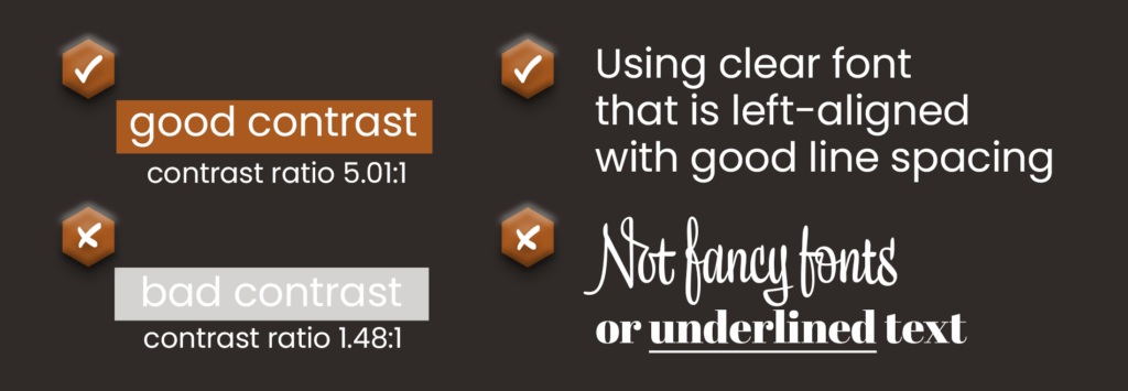
Designers have a lot to consider in terms of the layout and streamlined journey for site users. They also need to design in a clear way, considering the use of fonts, spacing, and colour contrast ratios.
Web Developers
Developers have a lot to consider when building sites in an inclusive way, such as:
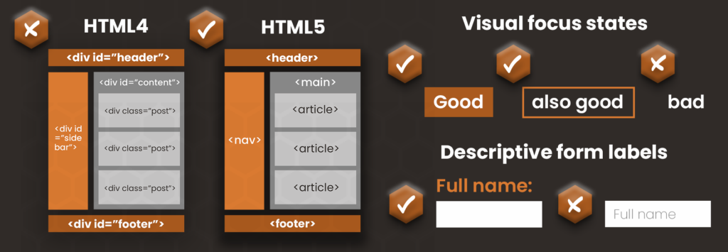
- Using the correct semantic html markup.
- Ensuring the site supports keyboard navigation and that users of assistive technology can all access all site features.
- Removing features that can’t be controlled by the user and page timeouts.
- Adding in elements such as skip-to-content links, descriptive form labels, and visual focus states to support those who are visually impaired.
Content editors
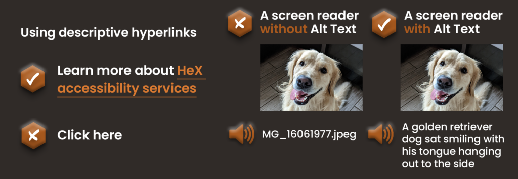
Content editors can look into the consistent structure of content. Starting by making sure that the site’s readability is, and continues to be, simple and user-friendly. Removing any jargon or hard words that users may struggle with. Along with adding items such as alt text to imagery, and writing descriptive hyperlinks, avoid writing phrases such as ‘click here’ instead of describing the links destination.
Even on social media, there are techniques to make sure that their social posts are inclusive across your channels. Learning how to correctly use items such as alt text, hashtags, and emojis.
Media teams
Your media team needs to add subtitles to all videos that they produce or create transcripts. Also, avoid creating animations that have flashing elements.
Administrators
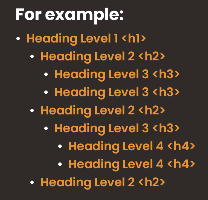
Administrators need to ensure that any documentation or PDFs that they are creating are accessible (e.g. ensuring heading structures are in place), if they are going to be added to a site or even shared internally.
By uniting as a whole will ensure that no matter what route your user takes to access your online information, services, or resources, they will be met with an inclusive platform.
These examples are just the tip of the iceberg when it comes to designing in an inclusive way. It can be a daunting task at the beginning of your accessibility journey; however, once you know how it will become second nature. Nowadays, there are useful Web Content Accessibility Guidelines in place that can guide you through ways to make your content meet government standards.

Need help with inclusive design?
Don’t worry if you aren’t quite sure how to achieve these suggestions! We have a great range of training to suit every level of your organisation to easily guide you through the changes needed.
